This research paper was presented at the IEEE Visualization Conference (opens in new tab) (VIS 2023), the premier forum for advances in visualization and visual analytics.

Effective data visualization plays a crucial role in data analysis. It enables data analysts and others to explore complex datasets, comprehend patterns, and convey meaningful insights to various stakeholders. Today, there are numerous tools for creating visual representations of data. However, these tools only work with tidy data, meaning that data points must be organized according to the specific categories required by the tool’s visualization format. This poses significant challenges for data analysts, requiring the use of additional tools to transform raw data into a compatible format before it is entered into one of these visualization tools.
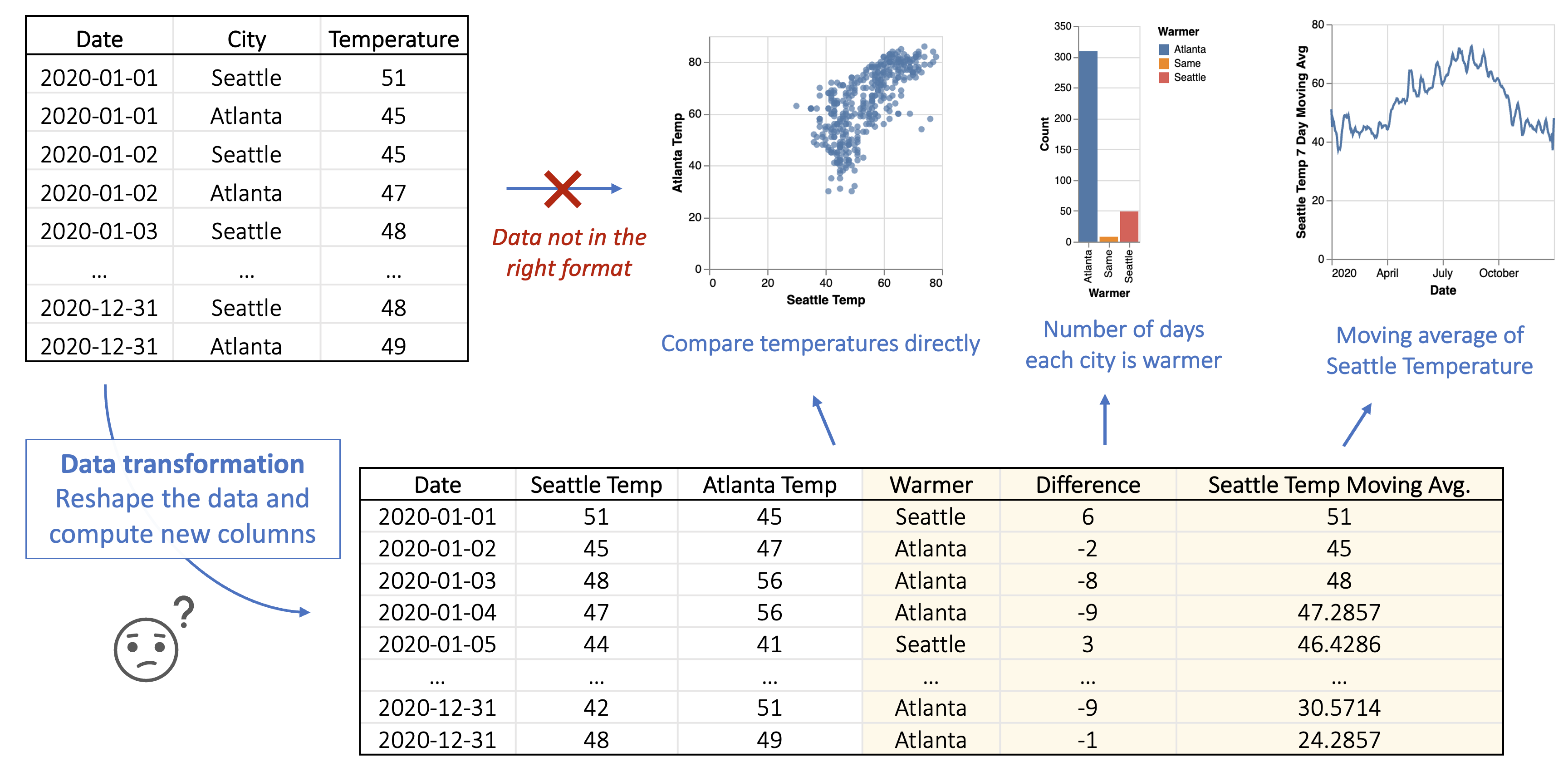
For instance, consider a dataset displaying 2020 temperatures in Seattle and Atlanta. If an analyst aims to create a scatter plot comparing the temperatures of these two US cities on the x/y-axes, data transformation is essential. The visualization tool mandates separate columns for Seattle and Atlanta temperatures to map to the scatter plot’s axes. Consequently, the analyst must pivot the input table to generate these columns. Moreover, if the analyst intends to compare which city experiences warmer days or create a smoothed line chart illustrating Seattle’s 7-day moving average temperature, further computations on the transformed data are necessary. Fields like “Warmer” and “Seattle 7-day Moving Avg” need to be calculated to facilitate the visualization, as depicted in Figure 1. This intricate process highlights the complexity and expertise currently needed to prepare raw data for effective visualization.
This hurdle is particularly daunting because it necessitates a certain level of programming expertise or familiarity with additional data processing tools. It highlights the complexities of data visualization and underscores the need for an easier and more seamless process for data analysts, enabling them to create impactful visualizations regardless of their technical background.
Against the backdrop of rapid advancements in learning language models (LLMs) and programming-by-example techniques, researchers have made significant strides in breaking down these barriers. In this context, we share our paper, “Data Formulator: AI-powered Concept-driven Visualization Authoring (opens in new tab),” presented at VIS 2023 (opens in new tab) and winner of the Best Paper Honorable Mention (opens in new tab) award. Data Formulator is an AI-powered visualization authoring tool developed through a collaboration between researchers studying AI and those studying human-computer interaction (HCI). The result is a new visualization paradigm that separates high-level visualization intents from low-level data transformation steps. The process begins with data analysts articulating their visualization ideas as data concepts. These concepts refer to specific data categories, or fields, that analysts want to visualize, even though they are not present in the raw input data. This way, they effectively convey their visualization intent with the AI agent, which, in turn, assists them in implementing their visualization.
Defining data concepts and creating visualizations
The way Data Formula operates is straightforward. The analyst defines the specific data concepts they plan to visualize, either through natural language queries or by providing categories, or example entries for the concept. Once these concepts are defined, they are linked to appropriate visual representation, as illustrated in Figure 2.
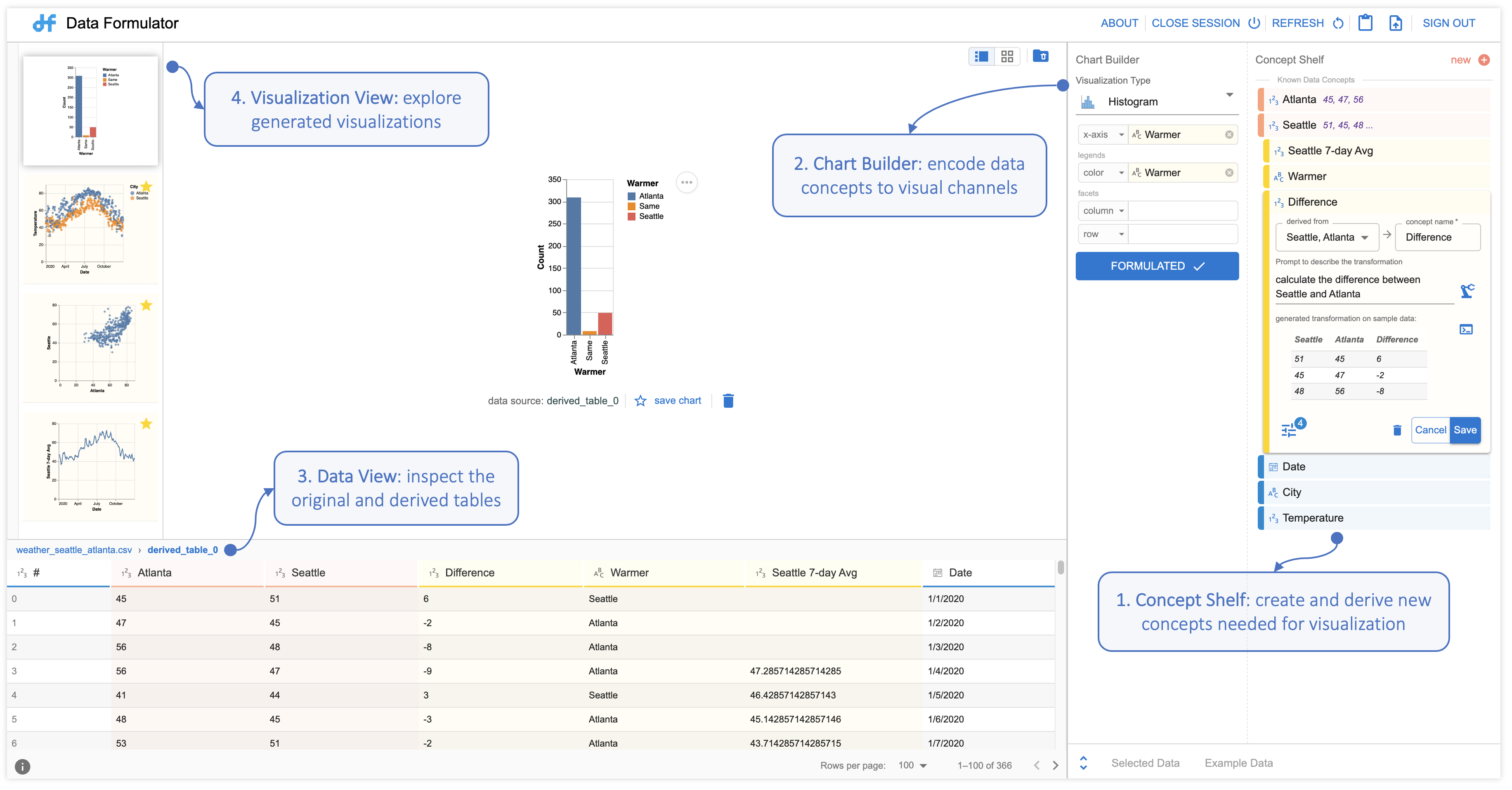
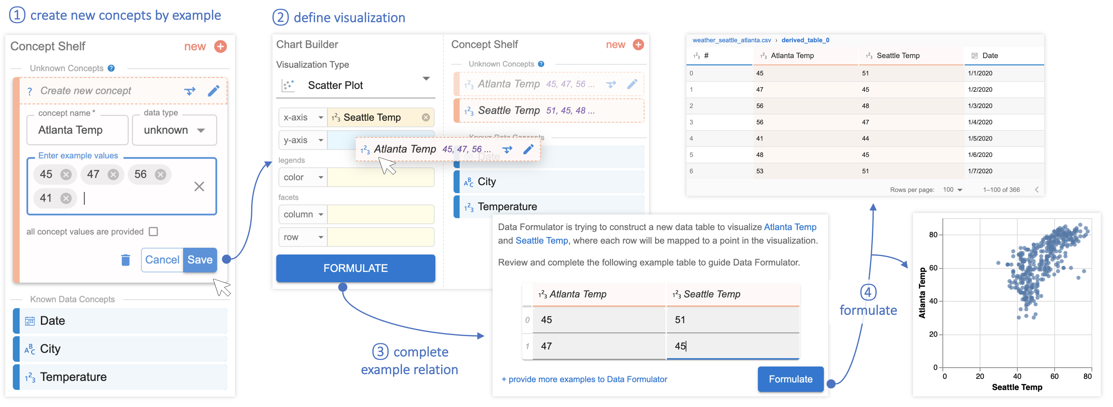
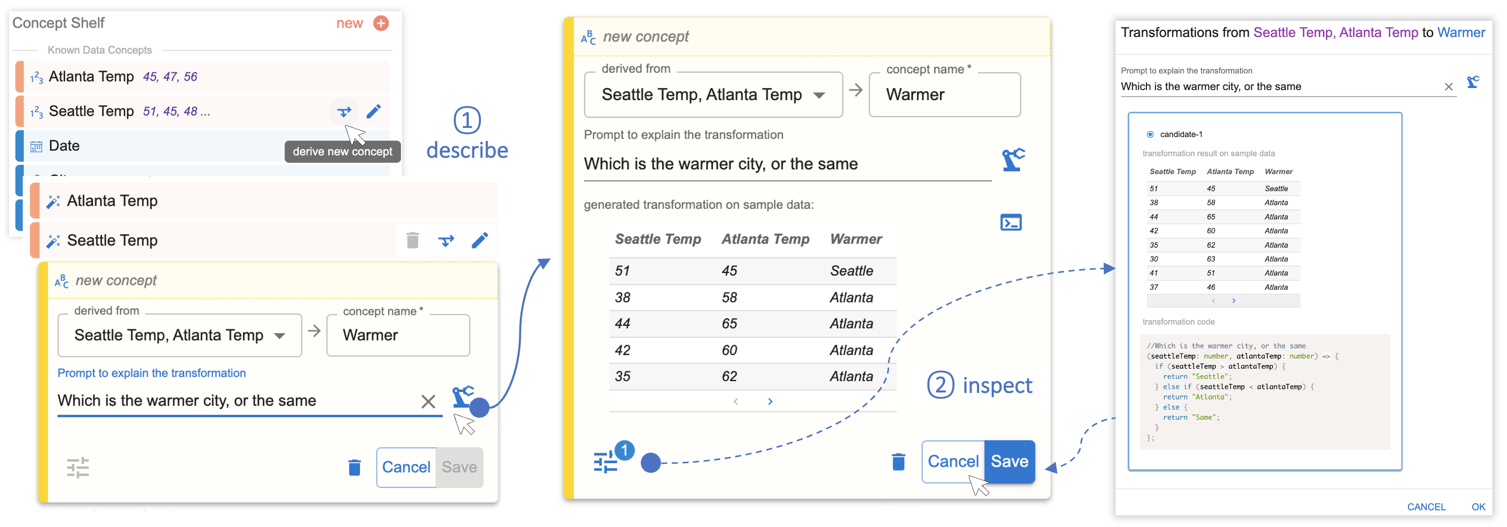
If the analyst defines concepts through examples, Data Formulator engages a program synthesizer, which generates a specialized data reshaping program, transforming the provided data to bring out the required data fields. Conversely, when an analyst introduces a new concept using natural language queries, Data Formulator calls on LLMs to generate code, which facilitates the creation of a new data category based on the provided description. In both cases, Data Formulator compiles the transformed data into a structured table and creates corresponding visualizations.
We recognize that analyst specifications can be ambiguous, so we designed Data Formulator to generate multiple visualization options to help them identify what they want. The tool also provides analysts with the AI-generated transformation program and the transformed data for inspection. This transparency helps analysts refine their intent for future iterations.
In continuing our Seattle/Atlanta temperatures example, the following two figures show how analysts can use Data Formulator to create visualizations without reformatting raw data using an external tool. Instead, the analyst provides example entries in the form of temperature values to create new the data concepts “Seattle Temp” and “Atlanta Temp,” shown in Figure 3. The analyst uses these natural language queries to create the new concept “Warmer” and instructs Data Formulator to format the data so that it can be visualized, shown in Figure 4.
Looking ahead: Analyst-AI collaboration in data analysis
AI-powered data analysis tools have the potential to significantly streamline the entire data analysis process by consolidating various tasks into a single tool. Beyond just visualization, this concept-driven technique can be applied to data cleaning, data integration, visual data exploration, and visual storytelling. Our vision is for an AI system to take high-level instruction from the user and automatically recommend the necessary steps across the entire data analysis pipeline, enabling collaboration between the user and the AI agent to achieve their data visualization goals.
Inevitably, data analysts will need to tackle more complex tasks beyond the scope mentioned here. For this reason, it’s crucial to consider how to design AI-powered tools that effectively convey results to the analyst that are uncertain, ambiguous, or incorrect. This ensures that the analyst can trust the tool and collaborate effectively with AI to accomplish their objectives.
The post Data Formulator: A concept-driven, AI-powered approach to data visualization appeared first on Microsoft Research.