Driver’s Ed: How Waabi Uses AI, Simulation to Teach Autonomous Vehicles to Drive

Teaching the AI brains of autonomous vehicles to understand the world as humans do requires billions of miles of driving experience. The road to achieving this astronomical level of driving leads to the virtual world.

On the latest episode of the AI Podcast, Waabi CEO and founder Raquel Urtasun joins NVIDIA’s Katie Burke Washabaugh to talk about the role simulation technology plays in developing production-level autonomous vehicles.

Waabi is an autonomous-vehicle system startup that uses powerful, high-fidelity simulation to run multiple scenarios simultaneously and tailor training to rare and dangerous situations that are difficult to encounter in the real world.

Urtasun is also a professor of Computer Science at the University of Toronto. Before starting Waabi, she led the Uber Advanced Technologies Group as chief scientist and head of research and development.

You Might Also Like

Polestar’s Dennis Nobelius on the Sustainable Performance Brand’s Plans

Driving enjoyment and autonomous driving capabilities can complement one another in intelligent, sustainable vehicles. Learn about the automaker’s plans to unveil its third vehicle, the Polestar 3, the tech inside it, and what the company’s racing heritage brings to the intersection of smarts and sustainability.

GANTheftAuto: Harrison Kinsley on AI-Generated Gaming Environments

Humans playing games against machines is nothing new, but now computers can develop their own games for people to play. Programming enthusiast and social media influencer Harrison Kinsley created GANTheftAuto, an AI-based neural network that generates a playable chunk of the classic video game Grand Theft Auto V.

How Audio Analytic Is Teaching Machines to Listen

From active noise cancellation to digital assistants that are always listening for your commands, audio is perhaps one of the most important but often overlooked aspects of modern technology in our daily lives. Dr. Chris Mitchell, CEO and founder of Audio Analytic, discusses the challenges, and the fun, involved in teaching machines to listen.

Subscribe to the AI Podcast: Now available on Amazon Music

You can now listen to the AI Podcast through Amazon Music.

You can also get the AI Podcast through iTunes, Google Podcasts, Google Play, Castbox, DoggCatcher, Overcast, PlayerFM, Pocket Casts, Podbay, PodBean, PodCruncher, PodKicker, Soundcloud, Spotify, Stitcher and TuneIn.

Have a few minutes to spare? Fill out our listener survey.

The post Driver’s Ed: How Waabi Uses AI, Simulation to Teach Autonomous Vehicles to Drive appeared first on NVIDIA Blog.

Read More

Predict customer churn with no-code machine learning using Amazon SageMaker Canvas

Understanding customer behavior is top of mind for every business today. Gaining insights into why and how customers buy can help grow revenue. But losing customers (also called customer churn) is always a risk, and insights into why customers leave can be just as important for maintaining revenues and profits. Machine learning (ML) can help with insights, but up until now you needed ML experts to build models to predict churn, the lack of which could delay insight-driven actions by businesses to retain customers.

In this post, we show you how business analysts can build a customer churn ML model with Amazon SageMaker Canvas, no code required. Canvas provides business analysts with a visual point-and-click interface that allows you to build models and generate accurate ML predictions on your own—without requiring any ML experience or having to write a single line of code.

Overview of solution

For this post, we assume the role of a marketing analyst in the marketing department of a mobile phone operator. We have been tasked with identifying customers that are potentially at risk of churning. We have access to service usage and other customer behavior data, and want to know if this data can help explain why a customer would leave. If we can identify factors that explain churn, then we can take corrective actions to change predicted behavior, such as running targeted retention campaigns.

To do this, we use the data we have in a CSV file, which contains information about customer usage and churn. We use Canvas to perform the following steps:

  1. Import the churn dataset from Amazon Simple Storage Service (Amazon S3).
  2. Train and build the churn model.
  3. Analyze the model results.
  4. Test predictions against the model.

For our dataset, we use a synthetic dataset from a telecommunications mobile phone carrier. This sample dataset contains 5,000 records, where each record uses 21 attributes to describe the customer profile. The attributes are as follows:

  • State – The US state in which the customer resides, indicated by a two-letter abbreviation; for example, OH or NJ
  • Account Length – The number of days that this account has been active
  • Area Code – The three-digit area code of the customer’s phone number
  • Phone – The remaining seven-digit phone number
  • Int’l Plan – Whether the customer has an international calling plan (yes/no)
  • VMail Plan – Whether the customer has a voice mail feature (yes/no)
  • VMail Message – The average number of voice mail messages per month
  • Day Mins – The total number of calling minutes used during the day
  • Day Calls – The total number of calls placed during the day
  • Day Charge – The billed cost of daytime calls
  • Eve Mins, Eve Calls, Eve Charge – The billed cost for evening calls
  • Night Mins, Night Calls, Night Charge – The billed cost for nighttime calls
  • Intl Mins, Intl Calls, Intl Charge – The billed cost for international calls
  • CustServ Calls – The number of calls placed to customer service
  • Churn? – Whether the customer left the service (true/false)

The last attribute, Churn?, is the attribute that we want the ML model to predict. The target attribute is binary, meaning our model predicts the output as one of two categories (True or False).

Prerequisites

A cloud admin with an AWS account with appropriate permissions is required to complete the following prerequisites:

Create a customer churn model

First, let’s download the churn dataset and review the file to make sure all the data is there. Then complete the following steps:

  1. Sign in to the AWS Management Console, using an account with the appropriate permissions to access Canvas.
  2. Log in to the Canvas console.

This is where we can manage our datasets and create models.

  1. Choose Import.

Canvas Import Button Select

  1. Choose Upload and select the churn.csv file.
  2. Choose Import data to upload it to Canvas.

Canvas select data from s3

The import process takes approximately 10 seconds (this can vary depending on dataset size). When it’s complete, we can see the dataset is in Ready status.

Canvas Ready Dataset

  1. To preview the first 100 rows of the dataset, hover your mouse over the eye icon.

Canvas View Dataset

A preview of the dataset appears. Here we can verify that our data is correct.

Canvas Verify Data

After we confirm that the imported dataset is ready, we create our model.
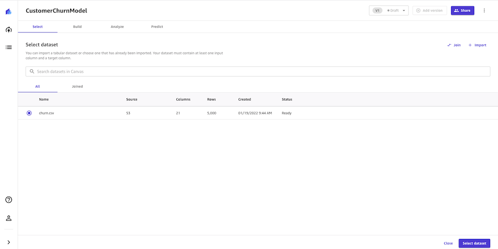
  1. Choose New model.

Canvas New Models

  1. Select the churn.csv dataset and choose Select dataset.

Canvas Select Dataset

Now we configure the build model process.

  1. For Target columns, choose the Churn? column.

For Model type, Canvas automatically recommends the model type, in this case 2 category prediction (what a data scientist would call binary classification). This is suitable for our use case because we have only two possible prediction values: True or False, so we go with the recommendation Canvas made.

Canvas Build Model

We now validate some assumptions. We want to get a quick view into whether our target column can be predicted by the other columns. We can get a fast view into the model’s estimated accuracy and column impact (the estimated importance of each column in predicting the target column).

  1. Select all 21 columns and choose Preview model.

This feature uses a subset of our dataset and only a single pass at modeling. For our use case, the preview model takes approximately 2 minutes to build.

Canvas Preview Model

As shown in the following screenshot, the Phone and State columns have much less impact on our prediction. We want to be careful when removing text input because it can contain important discrete, categorical features contributing to our prediction. Here, the phone number is just the equivalent of an account number—not of value in predicting other accounts’ likelihood of churn, and the customer’s state doesn’t impact our model much.

  1. We remove these columns because they have no major feature importance.Canvas Feature Engineering
  2. After we remove the Phone and State columns, let’s run the preview again.

As shown in the following screenshot, the model accuracy increased by 0.1%. Our preview model has a 95.9% estimated accuracy, and the columns with the biggest impact are Night Calls, Eve Mins, and Night Charge. This gives us an insight into what columns impact the performance of our model the most. Here we need to be careful when doing feature selection because if a single feature is extremely impactful on a model’s outcome, it’s a primary indicator of target leakage, and the feature won’t be available at the time of prediction. In this case, few columns showed very similar impact, so we continue to build our model.

Canvas Feature Engineering After

Canvas offers two build options:

  • Standard build – Builds the best model from an optimized process powered by AutoML; speed is exchanged for greatest accuracy
  • Quick build – Builds a model in a fraction of the time compared to a standard build; potential accuracy is exchanged for speed.
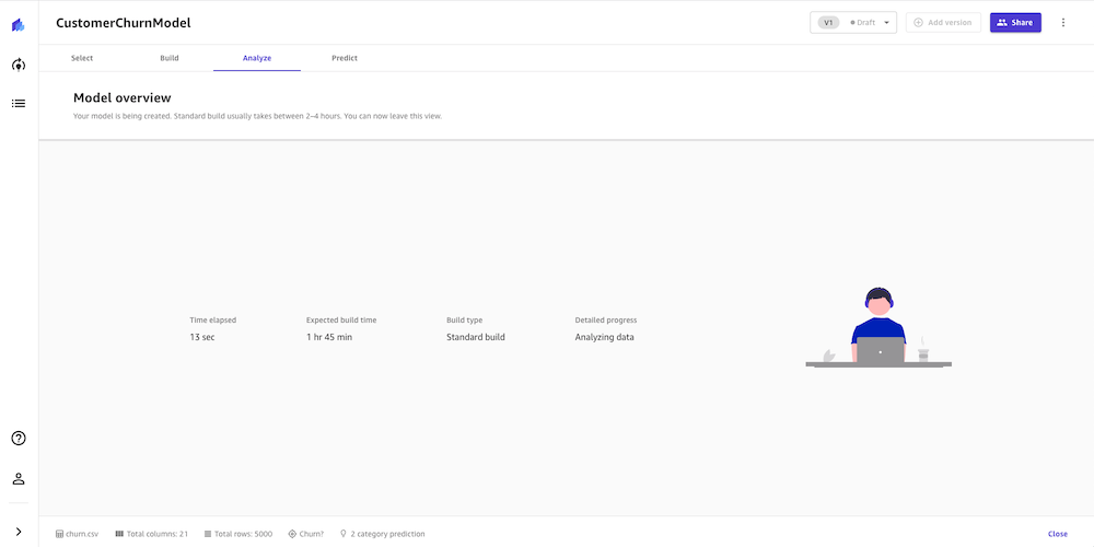
  1. For this post, we choose the Standard build option because we want to have the very best model and we are willing to spend additional time waiting the result.

Canvas Standard Build

The build process can take 2–4 hours. During this time, Canvas tests hundreds of candidate pipelines, selecting the best model to present to us. In the following screenshot, we can see the expected build time and progress.

Canvas Analyze Model

Evaluate model performance

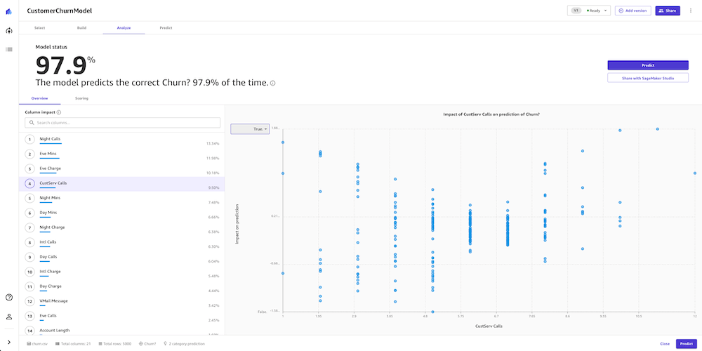
When the model building process is complete, the model predicted churn 97.9% of the time. This seems fine, but as analysts we want to dive deeper and see if we can trust the model to make decisions based on it. On the Scoring tab, we can review a visual plot of our predictions mapped to their outcomes. This allows us a deeper insight into our model.

Canvas separates the dataset into training and test sets. The training dataset is the data Canvas uses to build the model. The test set is used to see if the model performs well with new data. The Sankey diagram in the following screenshot shows how the model performed on the test set. To learn more, refer to Evaluating Your Model’s Performance in Amazon SageMaker Canvas.

Canvas Analyze Model Score

To get more detailed insights beyond what is displayed in the Sankey diagram, business analysts can use a confusion matrix analysis for their business solutions. For example, we want to better understand the likelihood of the model making false predictions. We can see this in the Sankey diagram, but want more insights, so we choose Advanced metrics. We’re presented with a confusion matrix, which displays the performance of a model in a visual format with the following values, specific to the positive class—we’re measuring based on whether they will in fact churn, so our positive class is True in this example:

  • True Positive (TP) – The number of True results that were correctly predicted as True
  • True Negative (TN) – The number of False results that were correctly predicted as False
  • False Positive (FP) – The number of False results that were wrongly predicted as True
  • False Negative (FN) – The number of True results that were wrongly predicted as False

We can use this matrix chart to determine not only how accurate our model is, but when it is wrong, how often that might be and how it’s wrong.

Canvas F1 Matrix

The advanced metrics look good. We can trust the model result. We see very low false positives and false negatives. These are if the model thinks a customer in the dataset will churn and they actually don’t (false positive), or if the model thinks the customer will churn and they actually do (false negative). High numbers for either might make us think more on if we can use the model to make decisions.

Let’s go back to Overview tab, to review the impact of each column. This information can help the marketing team gain insights that lead to taking actions to reduce customer churn. For example, we can see that both low and high CustServ Calls increase the likelihood of churn. The marketing team can take actions to prevent customer churn based on these learnings. Examples include creating a detailed FAQ on websites to reduce customer service calls, and running education campaigns with customers on the FAQ that can keep engagement up.

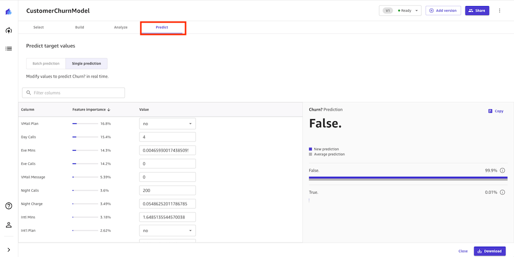
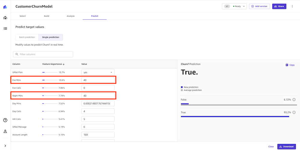
Our model looks pretty accurate. We can directly perform an interactive prediction on the Predict tab, either in batch or single (real-time) prediction. In this example, we made a few changes to certain column values and performed a real-time prediction. Canvas shows us the prediction result along with the confidence level.

Canvas Predict Inference

Let’s say we have an existing customer who has the following usage: Night Mins is 40 and Eve Mins is 40. We can run a prediction, and our model returns a confidence score of 93.2% that this customer will churn (True). We might now choose to provide promotional discounts to retain this customer.

Let’s say we have an existing customer who has the following the usage: Night Mins is 40 and Eve Mins is 40. We can run a prediction, and our model returns a confidence score of 93.2% that this customer will churn (True). We might now choose to provide promotion discounts to retain this customer.

Running one prediction is great for individual what-if analysis, but we also need to run predictions on many records at once. Canvas is able to run batch predictions, which allows you to run predictions at scale.

Conclusion

In this post, we showed how a business analyst can create a customer churn model with SageMaker Canvas using sample data. Canvas allows your business analysts to create accurate ML models and generate predictions using a no-code, visual, point-and-click interface. A marketing analysist can now use this information to run targeted retention campaigns and test new campaign strategies faster, leading to a reduction in customer churn.

Analysts can take this to the next level by sharing their models with data scientist colleagues. The data scientists can view the Canvas model in Amazon SageMaker Studio, where they can explore the choices Canvas AutoML made, validate model results, and even productionalize the model with a few clicks. This can accelerate ML-based value creation and help scale improved outcomes faster.

To learn more about using Canvas, see Build, Share, Deploy: how business analysts and data scientists achieve faster time-to-market using no-code ML and Amazon SageMaker Canvas. For more information about creating ML models with a no-code solution, see Announcing Amazon SageMaker Canvas – a Visual, No Code Machine Learning Capability for Business Analysts.


About the Author

Henry Robalino is a Solutions Architect at AWS, based out of NJ. He is passionate about cloud and machine learning, and the role they can play in society. He achieves this by working with customers to help them achieve their business goals using the AWS Cloud. Outside of work, you can find Henry traveling or exploring the outdoors with his fur daughter Arly.

Chaoran Wang is a Solution Architect at AWS, based in Dallas, TX. He has been working at AWS since graduating from the University of Texas at Dallas in 2016 with a master’s in Computer Science. Chaoran helps customers build scalable, secure, and cost-effective applications and find solutions to solve their business challenges on the AWS Cloud. Outside work, Chaoran loves spending time with his family and two dogs, Biubiu and Coco.

Read More

Azure Quantum innovation: Efficient error correction of topological qubits with Floquet codes

Qubits arranged in a square array on a two-dimensional surface. Measurements are done on the qubits in a sequence of checks, shown as a repeating pattern of three steps. In each step, one measures a check on each pair of neighboring qubits, shown as a line connecting those qubits, with the lines moving in a repeating pattern over the three steps.
This graphic shows the repeating three-step sequence of checks used in Floquet codes. Each circle represents a qubit, and a line between a pair of circles indicates that that check is measured on that time step. The colors indicate the type of operator measured in each check, either XX, YY, or ZZ, so that the type of check measured also changes with time. Learn more about this sequence of checks in the section “Unlocking a new class of quantum codes” below. 

Technological innovation that enables scaling of quantum computing underpins the Microsoft Azure Quantum program. In March of this year, we announced our demonstration of the underlying physics required to create a topological qubit—qubits that are theorized to be inherently more stable than existing ones without sacrificing size or speed. However, our quest to deliver a general-purpose quantum computer capable of addressing industrial-scale problems will require innovation across every layer of the quantum stack, from materials at the nanoscale to algorithms and applications. At Azure Quantum, our full-stack approach and broad expertise across all areas of quantum computation allows us to drive innovation in this space through tight collaboration across theory, hardware, software and systems teams. 

One of the greatest challenges in building a quantum computer is that quantum states are intrinsically fragile and are quickly destroyed when a qubit couples to its environment, leading to noise. A crucial technology to overcome this fragility, which is also used in classical digital computing, is error correction. By encoding the state of a single logical qubit into many physical qubits, quantum error correction (QEC) has the ability to detect and correct most errors that occur on the physical qubits. Indeed, such error correction needs to be at the heart of any scalable quantum system. Without it, no known qubit technology can protect quantum states sufficiently long enough to perform a calculation that can deliver real-world impact. However, quantum error correction also comes at a significant cost: depending on the quality of the physical qubits, error correction can increase the space requirements of a computation by a factor of several thousand and the time requirements more than tenfold. Therefore, any improvements on error correction have enormous positive ripple effects across the entire stack.

In this post, we’ll share some exciting implications from our recent innovations toward scale—specifically how to perform quantum error correction in our topological quantum computation stack— published in the series of papers listed below. Topological qubits promise lower error rates than conventional qubits, and as such can perform scalable quantum computation at lower overhead. On top of that, in these papers we introduce a new class of quantum error correction codes, called Floquet codes, which are particularly suited to topological qubits. Our new approaches culminate in an additional tenfold or more reduction to the overhead needed for error correction on topological qubits compared to previous state of the art, opening a viable path toward scaling to a million qubits and beyond. 

Unlocking a new class of quantum codes 

To optimize performance on any quantum computing platform, the circuits must be adapted to the capabilities of the hardware. This is particularly true for error correction schemes, which must be tailor-made to exploit the strengths of a given hardware platform. Unlike most other qubits, our topological qubits employ a measurement-based scheme, where direct measurements between adjacent qubits are the native set of operations. While all quantum error correction schemes use frequent measurements to identify errors, the state-of-the-art schemes require complex multi-qubit measurements that can’t be implemented directly in the hardware and must be compiled into native operations at the expense of additional auxiliary qubits and additional timesteps. The outcomes of these measurements are used to infer the occurrence of errors without destroying the encoded quantum state. 

Our recent breakthroughs overcome this issue through a conceptually new perspective on quantum codes (put forward in “Dynamically Generated Logical Qubits” and “Boundaries for the Honeycomb code”), where the encoding of the quantum information is not static but rather allowed to periodically evolve in time. Many examples of physical systems are known where such periodic evolution allows new phenomena to occur (see, for example, the well-known Kapitza pendulum). The study of such systems falls under the term Floquet systems, which gives this new class of codes its name. 

These codes are built entirely from two-qubit measurements referred to as “check measurements.” Just like measurements in a conventional code, these are used to check for errors. The simplicity of these checks, however, means that each time we measure a check, we change the encoding of the quantum information, leading to the Floquet nature of the code. As a consequence, the outcomes of these measurements cannot be used directly to infer which errors have occurred, but rather the full history of measurement outcomes over time must be taken into account. 

The physical qubits are arranged in a lattice (such as that shown in Figure 1), represented as black dots on the vertices of this graph. Each check is associated with an edge of the graph, and one sequentially measures checks of different colors. The code state changes as the different checks are measured. There are several possible lattice arrangements of the qubits that allow for a natural implementation of a Floquet code. The lattices should have the following two properties: 1) each vertex should be attached to three edges and 2) using only three colors, it should be possible to color the plaquettes in such a way that no adjacent plaquettes have the same color (that is, the plaquettes should be “three-colorable”). While many such arrangements remain to be explored and the optimal choice will depend on details of the physical hardware, Figure 1 shows two possible Floquet-code arrangements. 

Two different ways of tiling a surface.  In the 4.8.8 code configuration on the left, the surface is tiled with octagons and squares, and in the honeycomb code configuration it is tiled with hexagons.  Each shows a possible arrangement of qubits in a Floquet code, with the qubits at the vertices of the tiling. The tiling displays some more complicated features at the boundary, but in the middle it is a regular tiling.
Figure 1: Lattice of qubits used for two different Floquet codes, the 4.8.8 code (left) and the honeycomb code (right). The optimal choice of code depends on the level of noise present and on correlations in the noise. 

Error correction tailor-made for topological qubits 

In the realm of our measurement-based topological architecture, we have identified the two arrangements shown in Figure 1 as particularly appealing when combined with a particular design of topological qubit—a “tetron” qubit—which is also a scalable design. The connectivity of these two layouts can be naturally mapped onto the connectivity of an array of such tetrons, which is shown in Figure 2. Furthermore, the majority of the two-qubit check operators that are used to construct these codes are exactly those native operations between tetrons that can be implemented with minimal error, as shown in the lower panel of Figure 2. The details of these codes, their implementation with topological qubits, and numerical studies of their performance are discussed in “Performance of planar Floquet codes with Majorana-based qubits.”

Top panel: an array of qubits.  Each qubit is shown as a sideways “H,” with the long edges of the “H” being topological wires supporting Majorana modes, giving four Majorana modes on each qubit at the points of the “H.” The bottom panel shows different loops connecting different qubits to measure checks of the code.
Figure 2: Upper panel: Physical array of tetron qubits that can be used to implement either the honeycomb or 4.8.8 Floquet code. Lower panel: Mapping of measurement operations into physical interference loops that are used for two-qubit measurements. 

Our numerical simulations show that our Floquet codes and architecture implemented with topological “tetron” qubits help secure the path to a scalable quantum system in several ways. First, the very favorable threshold of these codes, which we estimate to be close to 1 percent, allows us to achieve quantum error correction earlier and demonstrate tangible steps on our journey toward quantum advantage. Second, in the longer run, we find that these codes reduce the overhead required for quantum error correction on topological qubits roughly tenfold compared to the previous state-of-the-art approach, which means that our scalable system can be built from fewer physical qubits and can run at a faster clock speed (see Figure 3 below).

A plot of the overhead due to error correction as a function of the performance of the physical qubits.  As the physical qubits are improved (lower noise, on the left side of the plot), the overhead is reduced. The plot shows that the Floquet codes outperform other codes by an order of magnitude.
Figure 3: Comparison of the spacetime overhead between the previous state-of-the-art (blue, dashed line) and the newly developed Floquet codes (black, solid line), both for an implementation on topological qubits. See Figure 8 in “Performance of planar Floquet codes with Majorana-based qubits” for more details. 

Approaching quantum computation from the unique topological perspective requires synchronized advancements across the entire Azure Quantum stack. Along with our recent demonstration of the building blocks for topological qubits, optimizing quantum error correction using Floquet codes represents a critical piece of the scientific foundation needed to achieve scaled quantum computation. These breakthroughs help establish a path and architecture for the industrial quantum machine.

The post Azure Quantum innovation: Efficient error correction of topological qubits with Floquet codes appeared first on Microsoft Research.

Read More

GFN Thursday Caught in 4K: 27 Games Arriving on GeForce NOW in May, Alongside 4K Streaming to PC and Mac Apps

Enjoy the finer things in life. May is looking pixel perfect for GeForce NOW gamers.

RTX 3080 members can now take their games to the next level, streaming at 4K resolution on the GeForce NOW PC and Mac native apps — joining 4K support in the living room with SHIELD TV.

There’s also a list of 10 titles ready to play today, led by Star Wars Battlefront II, Star Wars Jedi: Fallen Order and Star Wars: Squadrons — all part of the 27 total games joining the GeForce NOW library in May.

Play in 4K Today

GeForce NOW is always upgrading. As of today, RTX 3080 members playing from the PC and Mac native apps can stream at 4K resolution at 60 frames per second.

Play in 4K on GeForce NOW
Stream in 4K on GeForce NOW with an RTX 3080 membership.

4K streaming gets a boost by NVIDIA DLSS, groundbreaking AI rendering technology that increases graphics performance using dedicated Tensor Core AI processors on RTX GPUs. DLSS taps into the power of a deep learning neural network to boost frame rates and generate beautiful, sharp images for games.

RTX 3080 members enjoy the benefits of ultra-low latency that rivals native console gaming. They can also enable customized in-game graphics settings like RTX ON, taking games to a cinematic level, and experience the maximized eight-hour play sessions.

On top of this, GeForce NOW is leveling up mobile gamers with support for more 120Hz devices capable of streaming at 120 FPS with RTX 3080 memberships. Newly supported devices include the Samsung Galaxy S22 and S22 Ultra, Galaxy Z Fold3 and Flip3, and OnePlus 9 Pro.

Visit our RTX 3080 setup guides for more information on 4K resolution on PC and macOS, and check out all of the new 120Hz Android devices.

Fan-Favorite Star Wars Games, Now in 4K

This week delivers three new games from Electronic Arts, and the far reaches of the galaxy, to the cloud — all streaming at up to 4K quality with a GeForce NOW RTX 3080 membership.

Be the hero in Star Wars Battlefront II (Steam and Origin, Rated T for Teen by the ESRB). Experience rich multiplayer battlegrounds of all three eras — prequel, classic and new trilogy — or rise as a new hero and discover a gripping single-player story spanning 30 years.

A galaxy-spanning adventure awaits in Star Wars Jedi: Fallen Order (Steam and Origin, Rated T for Teen by the ESRB). Rebuild the Jedi Order by developing powerful Force abilities and mastering the art of the lightsaber — all while staying one step ahead of the Empire in this third-person action-adventure title.

Speed through the stars and master the art of starfighter combat in Star Wars: Squadrons (Steam and Origin, Rated T for Teen by the ESRB). Buckle up and feel the adrenaline of first-person, multiplayer space dogfights alongside your squadron in this authentic piloting experience.

Play all of these fantastic titles, now streaming to PC, Mac, Chromebook, mobile devices and more with GeForce NOW.

Mayday, Mayday – May Games Inbound

We’re kicking the month off with May’s new gaming arrivals.

Our new “Instant Play Free Demos” row just got a little bit bigger. Members can now try out Backbone: Prologue streaming on the cloud before jumping into the full title.

Members can also dive into 27 total games coming in May, with 10 titles leading the pack this week.

The following are ready to stream today:

Plus, it’s evil. It’s dead. Evil Dead: The Game (Epic Games Store) is coming to GeForce NOW this month.

Evil Dead: The Game on GeForce NOW
Get ready to play ‘Evil Dead: The Game’ this month – groovy!

Step into the shoes of Ash Williams or his friends from the iconic Evil Dead franchise in a game loaded with co-op and PVP multiplayer action. Survive as a team of four and brandish your short barrel shotgun, chainsaw, cleavers and more against the armies of darkness. Or take control of the Kandarian Demon and seek to swallow their souls — all at up to 1440p and 120 FPS or 4K at 60 FPS on PC and Mac, and up to 4K on SHIELD TV with an RTX 3080 membership.

Coming in May:

  • Brigandine The Legend of Runersia (New release on Steam, May 11)
  • Neptunia x SENRAN KAGURA: Ninja Wars (New release on Steam, May 11)
  • Cepheus Protocol Anthology (New release on Steam, May 13)
  • Evil Dead: The Game (New release on Epic Games Store, May 13)
  • Old World (New release on Steam, May 19)
  • Vampire: The Masquerade Swansong (New release on Epic Games Store, May 19)
  • Crossfire: Legion (New release on Steam, May 24)
  • Out There: Oceans of Time (New release on Steam, May 26)
  • My Time at Sandrock (New release on Steam, May 26)
  • Turbo Sloths (New release on Steam, May 27)
  • Pogostuck: Rage With Your Friends (Steam)
  • Raji: An Ancient Epic (Steam and Epic Games Store)
  • Star Conflict (Steam)
  • THE KING OF FIGHTERS XV (Steam and Epic Games Store)
  • The Planet Crafter (Steam)
  • The Political Machine 2020 (Steam)
  • Yet Another Zombie Defense HD (Steam)

A Lotta Extra From April

On top of the titles announced in April, an extra 22 ended up coming to the cloud. Check out the additional games that were added last month:

The game Cities in Motion 2 (Steam) was also announced in April, but didn’t quite make it.

Finally, we’ve got a question for you. With all of these new games, we’re pretty sure we know the answer to this one. Let us know on Twitter or in the comments below.


The post GFN Thursday Caught in 4K: 27 Games Arriving on GeForce NOW in May, Alongside 4K Streaming to PC and Mac Apps appeared first on NVIDIA Blog.

Read More

Unpacking black-box models

Modern machine-learning models, such as neural networks, are often referred to as “black boxes” because they are so complex that even the researchers who design them can’t fully understand how they make predictions.

To provide some insights, researchers use explanation methods that seek to describe individual model decisions. For example, they may highlight words in a movie review that influenced the model’s decision that the review was positive.

But these explanation methods don’t do any good if humans can’t easily understand them, or even misunderstand them. So, MIT researchers created a mathematical framework to formally quantify and evaluate the understandability of explanations for machine-learning models. This can help pinpoint insights about model behavior that might be missed if the researcher is only evaluating a handful of individual explanations to try to understand the entire model.

“With this framework, we can have a very clear picture of not only what we know about the model from these local explanations, but more importantly what we don’t know about it,” says Yilun Zhou, an electrical engineering and computer science graduate student in the Computer Science and Artificial Intelligence Laboratory (CSAIL) and lead author of a paper presenting this framework.

Zhou’s co-authors include Marco Tulio Ribeiro, a senior researcher at Microsoft Research, and senior author Julie Shah, a professor of aeronautics and astronautics and the director of the Interactive Robotics Group in CSAIL. The research will be presented at the Conference of the North American Chapter of the Association for Computational Linguistics.

Understanding local explanations

One way to understand a machine-learning model is to find another model that mimics its predictions but uses transparent reasoning patterns. However, recent neural network models are so complex that this technique usually fails. Instead, researchers resort to using local explanations that focus on individual inputs. Often, these explanations highlight words in the text to signify their importance to one prediction made by the model.

Implicitly, people then generalize these local explanations to overall model behavior. Someone may see that a local explanation method highlighted positive words (like “memorable,” “flawless,” or “charming”) as being the most influential when the model decided a movie review had a positive sentiment. They are then likely to assume that all positive words make positive contributions to a model’s predictions, but that might not always be the case, Zhou says.

The researchers developed a framework, known as ExSum (short for explanation summary), that formalizes those types of claims into rules that can be tested using quantifiable metrics. ExSum evaluates a rule on an entire dataset, rather than just the single instance for which it is constructed.

Using a graphical user interface, an individual writes rules that can then be tweaked, tuned, and evaluated. For example, when studying a model that learns to classify movie reviews as positive or negative, one might write a rule that says “negation words have negative saliency,” which means that words like “not,” “no,” and “nothing” contribute negatively to the sentiment of movie reviews.

Using ExSum, the user can see if that rule holds up using three specific metrics: coverage, validity, and sharpness. Coverage measures how broadly applicable the rule is across the entire dataset. Validity highlights the percentage of individual examples that agree with the rule. Sharpness describes how precise the rule is; a highly valid rule could be so generic that it isn’t useful for understanding the model.

Testing assumptions

If a researcher seeks a deeper understanding of how her model is behaving, she can use ExSum to test specific assumptions, Zhou says.

If she suspects her model is discriminative in terms of gender, she could create rules to say that male pronouns have a positive contribution and female pronouns have a negative contribution. If these rules have high validity, it means they are true overall and the model is likely biased.

ExSum can also reveal unexpected information about a model’s behavior. For example, when evaluating the movie review classifier, the researchers were surprised to find that negative words tend to have more pointed and sharper contributions to the model’s decisions than positive words. This could be due to review writers trying to be polite and less blunt when criticizing a film, Zhou explains.

“To really confirm your understanding, you need to evaluate these claims much more rigorously on a lot of instances. This kind of understanding at this fine-grained level, to the best of our knowledge, has never been uncovered in previous works,” he says.

“Going from local explanations to global understanding was a big gap in the literature. ExSum is a good first step at filling that gap,” adds Ribeiro.

Extending the framework

In the future, Zhou hopes to build upon this work by extending the notion of understandability to other criteria and explanation forms, like counterfactual explanations (which indicate how to modify an input to change the model prediction). For now, they focused on feature attribution methods, which describe the individual features a model used to make a decision (like the words in a movie review).

In addition, he wants to further enhance the framework and user interface so people can create rules faster. Writing rules can require hours of human involvement — and some level of human involvement is crucial because humans must ultimately be able to grasp the explanations — but AI assistance could streamline the process.

As he ponders the future of ExSum, Zhou hopes their work highlights a need to shift the way researchers think about machine-learning model explanations.

“Before this work, if you have a correct local explanation, you are done. You have achieved the holy grail of explaining your model. We are proposing this additional dimension of making sure these explanations are understandable. Understandability needs to be another metric for evaluating our explanations,” says Zhou.

This research is supported, in part, by the National Science Foundation.

Read More

GraphWorld: Advances in Graph Benchmarking

Graphs are very common representations of natural systems that have connected relational components, such as social networks, traffic infrastructure, molecules, and the internet. Graph neural networks (GNNs) are powerful machine learning (ML) models for graphs that leverage their inherent connections to incorporate context into predictions about items within the graph or the graph as a whole. GNNs have been effectively used to discover new drugs, help mathematicians prove theorems, detect misinformation, and improve the accuracy of arrival time predictions in Google Maps.

A surge of interest in GNNs during the last decade has produced thousands of GNN variants, with hundreds introduced each year. In contrast, methods and datasets for evaluating GNNs have received far less attention. Many GNN papers re-use the same 5–10 benchmark datasets, most of which are constructed from easily labeled academic citation networks and molecular datasets. This means that the empirical performance of new GNN variants can be claimed only for a limited class of graphs. Confounding this issue are recently published works with rigorous experimental designs that cast doubt on the performance rankings of popular GNN models reported in seminal papers.

Recent workshops and conference tracks devoted to GNN benchmarking have begun addressing these issues. The recently-introduced Open Graph Benchmark (OGB) is an open-source package for benchmarking GNNs on a handful of massive-scale graph datasets across a variety of tasks, facilitating consistent GNN experimental design. However, the OGB datasets are sourced from many of the same domains as existing datasets, such as citation and molecular networks. This means that OGB does not solve the dataset variety problem we mention above. Therefore, we ask: how can the GNN research community keep up with innovation by experimenting on graphs with the large statistical variance seen in the real-world?

To match the scale and pace of GNN research, in “GraphWorld: Fake Graphs Bring Real Insights for GNNs”, we introduce a methodology for analyzing the performance of GNN architectures on millions of synthetic benchmark datasets. Whereas GNN benchmark datasets featured in academic literature are just individual “locations” on a fully-diverse “world” of potential graphs, GraphWorld directly generates this world using probability models, tests GNN models at every location on it, and extracts generalizable insights from the results. We propose GraphWorld as a complementary GNN benchmark that allows researchers to explore GNN performance on regions of graph space that are not covered by popular academic datasets. Furthermore, GraphWorld is cost-effective, running hundreds-of-thousands of GNN experiments on synthetic data with less computational cost than one experiment on a large OGB dataset.

Illustration of the GraphWorld pipeline. The user provides configurations for the graph generator and the GNN models to test. GraphWorld spawns workers, each one simulating a new graph with diverse properties and testing all specified GNN models. The test metrics from the workers are then aggregated and stored for the user.

The Limited Variety of GNN Benchmark Datasets
To illustrate the motivation for GraphWorld, we compare OGB graphs to a much larger collection (5,000+) of graphs from the Network Repository. While the vast majority of Network Repository graphs are unlabelled, and therefore cannot be used in common GNN experiments, they represent a large space of graphs that are available in the real world. We computed two properties of the OGB and Network Repository graphs: the clustering coefficient (how interconnected nodes are to nearby neighbors) and the degree distribution gini coefficient (the inequality among the nodes’ connection counts). We found that OGB datasets exist in a limited and sparsely-populated region of this metric space.

The distribution of graphs from the Open Graph Benchmark does not match the larger population of graphs from the Network Repository.

Dataset Generators in GraphWorld
A researcher using GraphWorld to investigate GNN performance on a given task first chooses a parameterized generator (example below) that can produce graph datasets for stress-testing GNN models on the task. A generator parameter is an input that controls high-level features of the output dataset. GraphWorld uses parameterized generators to produce populations of graph datasets that are varied enough to test the limits of state-of-the-art GNN models.

For instance, a popular task for GNNs is node classification, in which a GNN is trained to infer node labels that represent some unknown property of each node, such as user interests in a social network. In our paper, we chose the well-known stochastic block model (SBM) to generate datasets for this task. The SBM first organizes a pre-set number of nodes into groups or “clusters“, which serve as node labels to be classified. It then generates connections between nodes according to various parameters that (each) control a different property of the resulting graph.

One SBM parameter that we expose to GraphWorld is the “homophily” of the clusters, which controls the likelihood that two nodes from the same cluster are connected (relative to two nodes from different clusters). Homophily is a common phenomenon in social networks in which users with similar interests (e.g., the SBM clusters) are more likely to connect. However, not all social networks have the same level of homophily. GraphWorld uses the SBM to generate graphs with high homophily (below on the left), graphs with low homophily (below on the right), and millions more graphs with any level of homophily in-between. This allows a user to analyze GNN performance on graphs with all levels of homophily without depending on the availability of real-world datasets curated by other researchers.

Examples of graphs produced by GraphWorld using the stochastic block model. The left graph has high homophily among node classes (represented by different colors); the right graph has low homophily.

GraphWorld Experiments and Insights
Given a task and parameterized generator for that task, GraphWorld uses parallel computing (e.g., Google Cloud Platform Dataflow) to produce a world of GNN benchmark datasets by sampling the generator parameter values. Simultaneously, GraphWorld tests an arbitrary list of GNN models (chosen by the user, e.g., GCN, GAT, GraphSAGE) on each dataset, and then outputs a massive tabular dataset joining graph properties with the GNN performance results.

In our paper, we describe GraphWorld pipelines for node classification, link prediction, and graph classification tasks, each featuring different dataset generators. We found that each pipeline took less time and computational resources than state-of-the-art experiments on OGB graphs, which means that GraphWorld is accessible to researchers with low budgets.

The animation below visualizes GNN performance data from the GraphWorld node classification pipeline (using the SBM as the dataset generator). To illustrate the impact of GraphWorld, we first map classic academic graph datasets to an xy plane that measures the cluster homophily (x-axis) and the average of the node degrees (y-axis) within each graph (similar to the scatterplot above that includes the OGB datasets, but with different measurements). Then, we map each simulated graph dataset from GraphWorld to the same plane, and add a third z-axis that measures GNN model performance over each dataset. Specifically, for a particular GNN model (like GCN or GAT), the z-axis measures the mean reciprocal rank of the model against the 13 other GNN models evaluated in our paper, where a value closer to 1 means the model is closer to being the top performer in terms of node classification accuracy.

The animation illustrates two related conclusions. First, GraphWorld generates regions of graph datasets that extend well-beyond the regions covered by the standard datasets. Second, and most importantly, the rankings of GNN models change when graphs become dissimilar from academic benchmark graphs. Specifically, the homophily of classic datasets like Cora and CiteSeer are high, meaning that nodes are well-separated in the graph according to their classes. We find that as GNNs traverse toward the space of less-homophilous graphs, their rankings change quickly. For example, the comparative mean reciprocal rank of GCN moves from higher (green) values in the academic benchmark region to lower (red) values away from that region. This shows that GraphWorld has the potential to reveal critical headroom in GNN architecture development that would be invisible with only the handful of individual datasets that academic benchmarks provide.

Relative performance results of three GNN variants (GCN, APPNP, FiLM) across 50,000 distinct node classification datasets. We find that academic GNN benchmark datasets exist in GraphWorld regions where model rankings do not change. GraphWorld can discover previously unexplored graphs that reveal new insights about GNN architectures.

Conclusion
GraphWorld breaks new ground in GNN experimentation by allowing researchers to scalably test new models on a high-dimensional surface of graph datasets. This allows fine-grained analysis of GNN architectures against graph properties on entire subspaces of graphs that are distal from Cora-like graphs and those in the OGB, which appear only as individual points in a GraphWorld dataset. A key feature of GraphWorld is its low cost, which enables individual researchers without access to institutional resources to quickly understand the empirical performance of new models.

With GraphWorld, researchers can also investigate novel random/generative graph models for more-nuanced GNN experimentation, and potentially use GraphWorld datasets for GNN pre-training. We look forward to supporting these lines of inquiry with our open-source GraphWorld repository and follow-up projects.

Acknowledgements
GraphWorld is joint work with Brandon Mayer and Bryan Perozzi from Google Research. Thanks to Tom Small for visualizations.

Read More

Deploy and manage machine learning pipelines with Terraform using Amazon SageMaker

AWS customers are relying on Infrastructure as Code (IaC) to design, develop, and manage their cloud infrastructure. IaC ensures that customer infrastructure and services are consistent, scalable, and reproducible, while being able to follow best practices in the area of development operations (DevOps).

One possible approach to manage AWS infrastructure and services with IaC is Terraform, which allows developers to organize their infrastructure in reusable code modules. This aspect is increasingly gaining importance in the area of machine learning (ML). Developing and managing ML pipelines, including training and inference with Terraform as IaC, lets you easily scale for multiple ML use cases or Regions without having to develop the infrastructure from scratch. Furthermore, it provides consistency for the infrastructure (for example, instance type and size) for training and inference across different implementations of the ML pipeline. This lets you route requests and incoming traffic to different Amazon SageMaker endpoints.

In this post, we show you how to deploy and manage ML pipelines using Terraform and Amazon SageMaker.

Solution overview

This post provides code and walks you through the steps necessary to deploy AWS infrastructure for ML pipelines with Terraform for model training and inference using Amazon SageMaker. The ML pipeline is managed via AWS Step Functions to orchestrate the different steps implemented in the ML pipeline, as illustrated in the following figure.

Step Function Steps

Step Functions starts an AWS Lambda function, generating a unique job ID, which is then used when starting a SageMaker training job. Step Functions also creates a model, endpoint configuration, and endpoint used for inference. Additional resources include the following:

The ML-related code for training and inference with a Docker image relies mainly on existing work in the following GitHub repository.

The following diagram illustrates the solution architecture:

Architecture Diagram

We walk you through the following high-level steps:

  1. Deploy your AWS infrastructure with Terraform.
  2. Push your Docker image to Amazon ECR.
  3. Run the ML pipeline.
  4. Invoke your endpoint.

Repository structure

You can find the repository containing the code and data used for this post in the following GitHub repository.

The repository includes the following directories:

  • /terraform – Consists of the following subfolders:

    • ./infrastructure – Contains the main.tf file calling the ML pipeline module, in addition to variable declarations that we use to deploy the infrastructure
    • ./ml-pipeline-module – Contains the Terraform ML pipeline module, which we can reuse
  • /src – Consists of the following subfolders:

    • ./container – Contains example code for training and inference with the definitions for the Docker image
    • ./lambda_function – Contains the Python code for the Lambda function generating configurations, such as a unique job ID for the SageMaker training job
  • /data – Contains the following file:

    • ./iris.csv – Contains data for training the ML model

Prerequisites

For this walkthrough, you should have the following prerequisites:

Deploy your AWS infrastructure with Terraform

To deploy the ML pipeline, you need to adjust a few variables and names according to your needs. The code for this step is in the /terraform directory.

When initializing for the first time, open the file terraform/infrastructure/terraform.tfvars and adjust the variable project_name to the name of your project, in addition to the variable region if you want to deploy in another Region. You can also change additional variables such as instance types for training and inference.

Then use the following commands to deploy the infrastructure with Terraform:

export AWS_PROFILE=<your_aws_cli_profile_name>
cd terraform/infrastructure
terraform init
terraform plan
terraform apply

Check the output and make sure that the planned resources appear correctly, and confirm with yes in the apply stage if everything is correct. Then go to the Amazon ECR console (or check the output of Terraform in the terminal) and get the URL for your ECR repository that you created via Terraform.

The output should look similar to the following displayed output, including the ECR repository URL:

Apply complete! Resources: 19 added, 0 changed, 0 destroyed.

Outputs:

ecr_repository_url = <account_number>.dkr.ecr.eu-west-1.amazonaws.com/ml-pipeline-terraform-demo

Push your Docker image to Amazon ECR

For the ML pipeline and SageMaker to train and provision a SageMaker endpoint for inference, you need to provide a Docker image and store it in Amazon ECR. You can find an example in the directory src/container. If you have already applied the AWS infrastructure from the earlier step, you can push the Docker image as described. After your Docker image is developed, you can take the following actions and push it to Amazon ECR (adjust the Amazon ECR URL according to your needs):

cd src/container
export AWS_PROFILE=<your_aws_cli_profile_name>
aws ecr get-login-password --region eu-west-1 | docker login --username AWS --password-stdin <account_number>.dkr.ecr.eu-west-1.amazonaws.com
docker build -t ml-training .
docker tag ml-training:latest <account_number>.dkr.ecr.eu-west-1.amazonaws.com/<ecr_repository_name>:latest
docker push <account_number>.dkr.ecr.eu-west-1.amazonaws.com/<ecr_repository_name>

If you have already applied the AWS infrastructure with Terraform, you can push the changes of your code and Docker image directly to Amazon ECR without deploying via Terraform again.

Run the ML pipeline

To train and run the ML pipeline, go to the Step Functions console and start the implementation. You can check the progress of each step in the visualization of the state machine. You can also check the SageMaker training job progress and the status of your SageMaker endpoint.

Start Step Function

After you successfully run the state machine in Step Functions, you can see that the SageMaker endpoint has been created. On the SageMaker console, choose Inference in the navigation pane, then Endpoints. Make sure to wait for the status to change to InService.

SageMaker Endpoint Status

Invoke your endpoint

To invoke your endpoint (in this example, for the iris dataset), you can use the following Python script with the AWS SDK for Python (Boto3). You can do this from a SageMaker notebook, or embed the following code snippet in a Lambda function:

import boto3
from io import StringIO
import pandas as pd

client = boto3.client('sagemaker-runtime')

endpoint_name = 'Your endpoint name' # Your endpoint name.
content_type = "text/csv"   # The MIME type of the input data in the request body.

payload = pd.DataFrame([[1.5,0.2,4.4,2.6]])
csv_file = StringIO()
payload.to_csv(csv_file, sep=",", header=False, index=False)
payload_as_csv = csv_file.getvalue()

response = client.invoke_endpoint(
EndpointName=endpoint_name,
ContentType=content_type,
Body=payload_as_csv
)

label = response['Body'].read().decode('utf-8')
print(label)

Clean up

You can destroy the infrastructure created by Terraform with the command terraform destroy, but you need to delete the data and files in the S3 buckets first. Furthermore, the SageMaker endpoint (or multiple SageMaker endpoints if run multiple times) is created via Step Functions and not managed via Terraform. This means that the deployment happens when running the ML pipeline with Step Functions. Therefore, make sure you delete the SageMaker endpoint or endpoints created via the Step Functions ML pipeline as well to avoid unnecessary costs. Complete the following steps:

  1. On the Amazon S3 console, delete the dataset in the S3 training bucket.
  2. Delete all the models you trained via the ML pipeline in the S3 models bucket, either via the Amazon S3 console or the AWS CLI.
  3. Destroy the infrastructure created via Terraform:
    cd terraform/infrastructure
    terraform destroy

  4. Delete the SageMaker endpoints, endpoint configuration, and models created via Step Functions, either on the SageMaker console or via the AWS CLI.

Conclusion

Congratulations! You’ve deployed an ML pipeline using SageMaker with Terraform. This example solution shows how you can easily deploy AWS infrastructure and services for ML pipelines in a reusable fashion. This allows you to scale for multiple use cases or Regions, and enables training and deploying ML models with one click in a consistent way. Furthermore, you can run the ML pipeline multiple times, for example, when new data is available or you want to change the algorithm code. You can also choose to route requests or traffic to different SageMaker endpoints.

I encourage you to explore adding security features and adopting security best practices according to your needs and potential company standards. Additionally, embedding this solution into your CI/CD pipelines will give you further capabilities in adopting and establishing DevOps best practices and standards according to your requirements.


About the Author

Oliver Zollikofer is a Data Scientist at Amazon Web Services. He enables global enterprise customers to build, train and deploy machine learning models, as well as managing the ML model lifecycle with MLOps. Further, he builds and architects related cloud solutions.

Read More

Setting AIs on SIGGRAPH: Top Academic Researchers Collaborate With NVIDIA to Tackle Graphics’ Greatest Challenges

NVIDIA’s latest academic collaborations in graphics research have produced a reinforcement learning model that smoothly simulates athletic moves, ultra-thin holographic glasses for virtual reality, and a real-time rendering technique for objects illuminated by hidden light sources.

These projects — and over a dozen more — will be on display at SIGGRAPH 2022, taking place Aug. 8-11 in Vancouver and online. NVIDIA researchers have 16 technical papers accepted at the conference, representing work with 14 universities including Dartmouth College, Stanford University, the Swiss Federal Institute of Technology Lausanne and Tel Aviv University.

The papers span the breadth of graphics research, with advancements in neural content creation tools, display and human perception, the mathematical foundations of computer graphics and neural rendering.

Neural Tool for Multi-Skilled Simulated Characters

When a reinforcement learning model is used to develop a physics-based animated character, the AI typically learns just one skill at a time: walking, running or perhaps cartwheeling. But researchers from UC Berkeley, the University of Toronto and NVIDIA have created a framework that enables AI to learn a whole repertoire of skills — demonstrated above with a warrior character who can wield a sword, use a shield and get back up after a fall.

Achieving these smooth, life-like motions for animated characters is usually tedious and labor intensive, with developers starting from scratch to train the AI for each new task. As outlined in this paper, the research team allowed the reinforcement learning AI to reuse previously learned skills to respond to new scenarios, improving efficiency and reducing the need for additional motion data.

Tools like this one can be used by creators in animation, robotics, gaming and therapeutics. At SIGGRAPH, NVIDIA researchers will also present papers about 3D neural tools for surface reconstruction from point clouds and interactive shape editing, plus 2D tools for AI to better understand gaps in vector sketches and improve the visual quality of time-lapse videos.

Bringing Virtual Reality to Lightweight Glasses 

Most virtual reality users access 3D digital worlds by putting on bulky head-mounted displays, but researchers are working on lightweight alternatives that resemble standard eyeglasses.

A collaboration between NVIDIA and Stanford researchers has packed the technology needed for 3D holographic images into a wearable display just a couple millimeters thick. The 2.5-millimeter display is less than half the size of other thin VR displays, known as pancake lenses, which use a technique called folded optics that can only support 2D images.

The researchers accomplished this feat by approaching display quality and display size as a computational problem, and co-designing the optics with an AI-powered algorithm.

While prior VR displays require distance between a magnifying eyepiece and a display panel to create a hologram, this new design uses a spatial light modulator, a tool that can create holograms right in front of the user’s eyes, without needing this gap. Additional components — a pupil-replicating waveguide and geometric phase lens — further reduce the device’s bulkiness.

It’s one of two VR collaborations between Stanford and NVIDIA at the conference, with another paper proposing a new computer-generated holography framework that improves image quality while optimizing bandwidth usage. A third paper in this field of display and perception research, co-authored with New York University and Princeton University scientists, measures how rendering quality affects the speed at which users react to on-screen information.

Lightbulb Moment: New Levels of Real-Time Lighting Complexity

Accurately simulating the pathways of light in a scene in real time has always been considered the “holy grail” of graphics. Work detailed in a paper by the University of Utah’s School of Computing and NVIDIA is raising the bar, introducing a path resampling algorithm that enables real-time rendering of scenes with complex lighting, including hidden light sources.

Think of walking into a dim room, with a glass vase on a table illuminated indirectly by a street lamp located outside. The glossy surface creates a long light path, with rays bouncing many times between the light source and the viewer’s eye. Computing these light paths is usually too complex for real-time applications like games, so it’s mostly done for films or other offline rendering applications.

This paper highlights the use of statistical resampling techniques — where the algorithm reuses computations thousands of times while tracing these complex light paths — during rendering to approximate the light paths efficiently in real time. The researchers applied the algorithm to a classic challenging scene in computer graphics, pictured below: an indirectly lit set of teapots made of metal, ceramic and glass.

Related NVIDIA-authored papers at SIGGRAPH include a new sampling strategy for inverse volume rendering, a novel mathematical representation for 2D shape manipulation, software to create samplers with improved uniformity for rendering and other applications, and a way to turn biased rendering algorithms into more efficient unbiased ones.

Neural Rendering: NeRFs, GANs Power Synthetic Scenes

Neural rendering algorithms learn from real-world data to create synthetic images — and NVIDIA research projects are developing state-of-the-art tools to do so in 2D and 3D.

In 2D, the StyleGAN-NADA model, developed in collaboration with Tel Aviv University, generates images with specific styles based on a user’s text prompts, without requiring example images for reference. For instance, a user could generate vintage car images, turn their dog into a painting or transform houses to huts:

And in 3D, researchers at NVIDIA and the University of Toronto are developing tools that can support the creation of large-scale virtual worlds. Instant neural graphics primitives, the NVIDIA paper behind the popular Instant NeRF tool, will be presented at SIGGRAPH.

NeRFs, 3D scenes based on a collection of 2D images, are just one capability of the neural graphics primitives technique. It can be used to represent any complex spatial information, with applications including image compression, highly accurate representations of 3D shapes and ultra-high resolution images.

This work pairs with a University of Toronto collaboration that compresses 3D neural graphics primitives just as JPEG is used to compress 2D images. This can help users store and share 3D maps and entertainment experiences between small devices like phones and robots.

There are more than 300 NVIDIA researchers around the globe, with teams focused on topics including AI, computer graphics, computer vision, self-driving cars and robotics. Learn more about NVIDIA Research.

The post Setting AIs on SIGGRAPH: Top Academic Researchers Collaborate With NVIDIA to Tackle Graphics’ Greatest Challenges appeared first on NVIDIA Blog.

Read More