Deploying and using the Document Understanding Solution

Deploying and using the Document Understanding Solution

Based on our day to day experience, the information we consume is entirely digital. We read the news on our mobile devices far more than we do from printed copy newspapers. Tickets for sporting events, music concerts, and airline travel are stored in apps on our phones. One could go weeks or longer without needing to have any paper currency in his or her wallet, as digital payments are ubiquitous. However, many companies across different industries still primarily operate on manual, paper-based processes. For example, healthcare payors, construction companies, and law firms deal with billions of documents and forms, making the process of finding information difficult and time-consuming. When documents are found, extracting information through manual data entry can be slow, expensive, and error prone, resulting in increases in compliance risks. Furthermore, domain experts need to identify and categorize domain-specific phrases and keywords (or entities), or use traditional Optical Character Recognition (OCR) and keyword detection software that requires manual customization. These approaches can create scrambled output and unusable results. AWS AI services such as Amazon Kendra, Amazon Textract, Amazon Comprehend, and Amazon Comprehend Medical help solve these challenges by automating data extraction and comprehension using machine learning (ML).

Overview of the Document Understanding Solution

The Document Understanding Solution (DUS) allows you to use the power of AWS AI for enterprise search, document digitization, discovery, and extraction and redaction of select information. Part of the Intelligent Document Processing services offered from AWS, this solution uses AWS artificial intelligence (AI) services to solve business problems.

Search and discovery

These challenges exist in almost every business vertical. Imagine a manufacturer that has to maintain archives of thousands – if not millions – of product and tool specifications. Without document digitization of archives, there could be massive underutilization of their highly valuable tool data and information retrieval could be complex and costly. In another example, a company in the financial industry could have 1000s of financial reports in paper format. Without a simple way to extract and digitize this data, it could take an extensive manual effort to keypunch it.

To help with these situations, DUS leverages multiple ML services, including Amazon Textract. Amazon Textract is a fully managed machine learning service that automatically extracts text and data from scanned documents that goes beyond simple optical character recognition (OCR) to identify, understand, and extract data from forms and tables. Amazon Textract will move the data from the documents to a format that can be readily searched. Next, Amazon Kendra and Amazon Elasticsearch Service (Amazon ES) are available to provide the end user search experience in DUS. Amazon Kendra is an intelligent search service powered by machine learning. Amazon Kendra uses ML to obtain better results for natural language questions, and will return an exact answer from within a document, whether that is a text snippet, FAQ, or a PDF document. In addition to Amazon Kendra, the DUS provides a rich search experience to the user through the use of Amazon Elasticsearch Service. Amazon Elasticsearch Service is a fully managed service that makes it easy for you to deploy, secure, and run Elasticsearch cost effectively at scale.

Control and compliance

In addition to search, the ability to analyze documents at scale is essential. Amazon Textract extracts text from documents, which can then be input into Amazon Comprehend or Amazon Comprehend Medical. Amazon Comprehend is a natural language processing (NLP) service that uses machine learning to find insights and relationships in text. It can identify key phrases and entities, such as places, people, and brands. Amazon Comprehend Medical is similar to Comprehend. It is a natural language processing service that makes it easy to use machine learning to extract relevant medical information from unstructured text. It can identify medical entities, such as medical conditions and medications.

Identifying these key pieces of information allows for compliance controls through redaction. For example, an insurer could use this solution to feed a workflow that automatically redacts personally identifiable information (PII) or protected health information (PHI) for their review before archiving claim forms by automatically recognizing the important key-value pairs and entities that require protection.

Other industries can also use this solution for complying with regulatory standards, such as GDPR and HIPAA. For example, this solution could be used by a law firm to redact PII, organization names or brand names. Another example includes a security agency needing to redact all vital information such as names, locations and/or dates from a case file for data security or privacy concerns.

Workflow automation

The DUS solution delivers results at scale in production workflows. Organizations can more rapidly process documents such as insurance claims and forms, and seamlessly extract tables from PDFs into CSVs to conduct additional analysis. With detection and categorization of medical entities and ICD-10-CM ontologies, medical institutes can recognize exponential savings in workforce, time, and other resources that are spent identifying and classifying patient information. All the data is stored by the solution in easily accessible formats, such as CSV and JSON files, which can be fed into downstream pipelines. Additionally, the bulk processing feature in DUS allows you to import a large number of documents directly for processing and analysis.

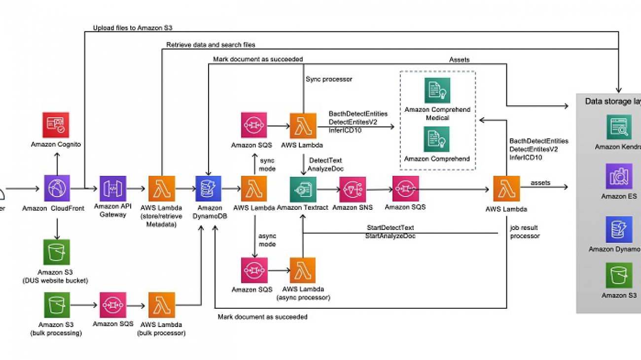
The following diagram illustrates the DUS architecture.


Deploying DUS

For instructions on setting up DUS, see Document Understanding Solution on AWS Solutions.

Deploying DUS sets up a web application that you can use for document understanding. The deployment includes setting up infrastructure in your AWS account and pre-loading sample documents.

Using DUS

Once you have successfully completed deploying the DUS demo, you are then provided with instructions on how to login into the application. After logging in, you are directed to the homepage, as seen below. You have three options which cover the common use-cases in document understanding solution: Discovery, Compliance, and Workflow Automation.

When you select the Discovery track you will be directed to the preloaded documents page or the Document List page. You may select one of the preloaded sample documents or upload your own document. From here, you can search for a specific document by using a phrase or keyword.

If you decide to upload your own document, choose upload your own documents above the available documents. You will then be directed to a new page to upload your own documents. This page also has sample documents from different industry verticals for you to experiment with.


Back on the Document List page, you will find some PDF and image files. Text in these documents are not actually tagged or available to use by default. However, since these documents have been processed by the solution, you will now be able to search for information within these documents. If you decide to search for a specific phrase or keyword in the search bar, then the solution will analyze the text it has extracted from the documents and provide you with search results. The search results can be displayed in three different ways; a comparative view of Amazon ES (traditional search) and Amazon Kendra (semantic search), just Amazon ES or just Amazon Kendra .

For Amazon Kendra results, you also have the option to provide feedback by either up-voting or down-voting an Amazon Kendra suggested answer.

Amazon Kendra also supports filtering based on user context. Under the Amazon Kendra results view, you can filter results based on the users for the preloaded documents. Click the Filter button to the right of the Amazon Kendra Results title. You can then select a persona and one of the suggested questions to display filtered results. Amazon Kendra will then rank results based on the selected persona. You can toggle between the various personas to compare how the results differ. For demonstration purposes, the Document Understanding Solution comes with preloaded documents and personas from the medical industry. You will be able to notice that based on the question and persona selected, results are ranked differently creating a more targeted search experience for the user.

From the Document List search results view, you can select a document that you want to further explore. This will direct you to the Document Details page. See the following image.

The following image shows the tool bar above the search bar, where you can choose to see different types of information from the document.


The tabs have the following functions:

  • Preview – Under this tab, you are able to view the original document as well as download a searchable PDF version of the document. This helps users to convert their documents – be it images or PDFs into easily searchable PDF files.
  • Raw Text – Under this tab, you can access all the text identified in the file.
  • Key-Value Pairs – Under this tab, key-value pairs from the document are highlighted. In this process, all forms in the document are identified and stored in a key-value pair format. If desired, you can download a CSV file of the key-value pairs. This is especially useful for organizations that have structured data and would want to automate their data extraction and storage workflows. For example, organizations that have a lot of forms like job applications or medical patient forms.
  • Tables – Under this tab, you can view all the tables identified in the document. Like the key-value pairs, you can download the tables in the CSV format. Companies dealing with balance sheets or with invoices would find this feature extremely useful since it allows users to easily convert tables, images and PDFs into CSV files which can then be used for further analysis.
  • Entities and Medical Entities – Under these tabs, you can find the general and medical entities in the document respectively. These entities include persons, locations, dates, PHI and medical information which helps organization to easily identify and extract critical medical data in a document.

For exploring redaction controls, choose the Compliance option on the toolbar. Here you can choose to redact information like key-value pairs, entities, medical entities or even keyword matches by switching to the respective tabs on the tool bar and choosing Redact. One example of how this feature may be useful is to consider a clinic that wants to redact PHI information before they decide to share medical records. Another example is an organization that wants to redact specific information identified as keylue pairs in forms present in their documents. As seen in the following image, you can redact information, download the redacted document and even clear redactions after use.

In terms of Workflow Automation, the Document Understanding Solution also provides some input and output capabilities via the AWS Console which makes it easier to integrate DUS into an existing pipeline. DUS supports a bulk document processing mode, in which you can simply input documents into an Amazon Simple Storage Service (Amazon S3) bucket which will be asynchronously analyzed and made available in the application. More information on bulk processing is available on the AWS Solutions Implementation Guide. Results from the different AWS AI services are all stored within Amazon S3 buckets and the corresponding metadata is available in Amazon DynamoDB tables. This helps users of the solution to build downstream pipelines from these datastores that hold the document analysis data.

Summary:

This post reviewed how you can integrate Amazon Textract, Amazon Comprehend, Amazon Comprehend Medical, and Amazon Kendra to conduct enterprise search, document digitization, document discovery, and extraction and redaction of select information.

To access the DUS source code, see Document Understanding Solution on GitHub. This solution has been made open source so that you can extend and incorporate the solution into your AWS workflows.


About the Authors

Simran Baxendale is a Program Manager in the Amazon Machine Learning Solutions Lab. She helps define, coordinate and execute program strategy for the demos applications team.


Curtis Bray is a manager in the Amazon Machine Learning Solutions Lab. He leads the demos applications team that focuses on building use case based demos that show customers how to unlock the power of AWS AI/ML services to solve real world business problems.


Alex Chirayath is an SDE in the Amazon Machine Learning Solutions Lab. He helps customers adopt AWS AI services by building solutions to address common business problems.

Read More

Training and serving H2O models using Amazon SageMaker

Training and serving H2O models using Amazon SageMaker

Model training and serving steps are two essential pieces of a successful end-to-end machine learning (ML) pipeline. These two steps often require different software and hardware setups to provide the best mix for a production environment. Model training is optimized for a low-cost, feasible total run duration, scientific flexibility, and model interpretability objectives, whereas model serving is optimized for low cost, high throughput, and low latency objectives.

Therefore, a wide-spread approach is to train a model with a popular data science language like Python or R, and create model artifact formats such as Model Object, Optimized (MOJO), Predictive Model Markup Language (PMML) or Open Neural Network Exchange (ONNX) and serve the model on a microservice (e.g., Spring Boot application) based on Open Java Development Kit (OpenJDK).

This post demonstrates how to implement this approach end-to-end using Amazon SageMaker for the popular open-source ML framework H2O. Amazon SageMaker is a fully managed service that provides every developer and data scientist the ability to build, train, and deploy ML models quickly. Amazon SageMaker is a versatile ML service, which allows you to use ML frameworks and programming languages of your choice. H2O was founded by H2O.ai, an AWS Partner Network (APN) Advanced Partner. You can choose from a wide range of options to train and deploy H2O models on the AWS Cloud, and H2O provides some design pattern examples to productionize H2O ML pipelines.

The H2O framework supports three type of model artifacts, as summarized in the following table.

Dimension Binary Models Plain Old Java Object (POJO) Model Object, Optimized (MOJO)
Definition The H2O binary model is intended for non-production ML experimentation with the features supported by a specific H2O version. A POJO is an ordinary Java object, not bounded by any special restriction. It’s a way to export a model built in H2O and implement it in a Java application. A MOJO is also a Java object, but the model tree is out of this object, because it has a generic tree-walker code to navigate the model. This allows model artifacts to be much smaller.
Use case Intended for interactive ML experimentation. Suitable for production usage. Suitable for production usage
Deployment Restrictions The model hosting image should run an H2O cluster and the same h2o version as the binary model. 1 GB maximum model artifact file size restriction for H2O. No size restriction for H2O.
Inference Performance High latency (up to a few seconds)—not recommended for production. Only slightly faster than MOJOs for binomial and regression models. Latency is typically in single-digit milliseconds. Significant inference efficiency gains over POJOs for multi-nominal and large models. Latency is typically in single-digit milliseconds.

During my trials, I explored some of the design patterns that Amazon SageMaker manages end to end, summarized in the following table.

ID Design Pattern Advantages Disadvantages
A

Train and deploy the model with the Amazon SageMaker Marketplace algorithm offered by H2O.ai


No effort is required to create any custom container and Amazon SageMaker algorithm resource. An older version of the h2o Python library is available. All other disadvantages in option B also apply to this option.
B

Train using a custom container with h2o Python library. Export the model artifact as H2O binary model format. Serve the model using a custom container running a Flask application and running inference by h2o Python library.


It’s possible to use any version of the h2o Python library. H2O binary model inference latency is significantly higher than MOJO artifacts. It’s prone to failures due to h2o Python library version incompatibility.
C

Train using a custom container with the h2o Python library. Export the model in MOJO format. Serve the model using a custom container running a Flask application and running inference by pyH2oMojo.


Because MOJO model format is supported, the model inference latency is lower than option B and it’s possible to use any version of the h2o Python library. Using pyH2oMojo has a higher latency and it’s prone to failures due to weak support for continuously evolving H2O versions.
D Train using a custom container with the h2o Python library. Export the model in MOJO format. Serve the model using a custom container based on Amazon Corretto running a Spring Boot application and h2o-genmodel Java library. It’s possible to use any version of h2o Python library and h2o-genmodel libraries. It offers the lowest model inference latency. The majority of data scientists prefer using only scripting languages.

It’s possible to add a few more options to the preceding list, especially if you want to run distributed training with Sparkling Water. After testing all these alternatives, I have concluded that design pattern D is the most suitable option for a wide range of use cases to productionize H2O. Design pattern D is built by a custom model training container with the h2o Python library and a custom model inference container with Spring Boot application and h2o-genmodel Java library. This post shows how to build an ML workflow based on this design pattern in the subsequent sections.

Problem and dataset

You can use the Titanic Passenger Survival dataset, which is publicly available thanks to Kaggle and encyclopedia-titanica, to build a predictive model that answers what kind of people are more likely to survive in a catastrophic shipwreck. It uses 11 independent variables such as age, gender, and passenger class to predict the binary classification target variable Survived. For this post, we split the original training dataset 80%/20% to create train.csv and validation.csv input files. The datasets are located under the /examples directory of the parent repository. This dataset requires features preprocessing operations like data imputation of null values for the Age feature and string indexing for Sex and Embarked features to train a model using the Gradient Boosting Machines (GBM) algorithm using the H2O framework.

Overview of solution

The solution in this post offers an ML training and deployment process orchestrated by AWS Step Functions and implemented with Amazon SageMaker. The following diagram illustrates the workflow.

This workflow is developed using a JSON-based language called Amazon State Language (ASL). The Step Functions API provides service integrations to Amazon SageMaker, child workflows, and other services.

Two Amazon Elastic Container Registry (Amazon ECR) images contain the code mentioned in design pattern D:

  • h2o-gbm-trainer – H2O model training Docker image running a Python application
  • h2o-gbm-predictor – H2O model inference Docker image running a Spring Boot application

The creation of a manifest.json file in an Amazon Simple Storage Service (Amazon S3) bucket initiates an event notification, which starts the pipeline. This file can be generated by a prior data preparation job, which creates the training and validation datasets during a periodical production run. Uploading this file triggers an AWS Lambda function, which collects the ML workflow run duration configurations from the manifest.json file and AWS Systems Manager Parameter Store and starts the ML workflow.

Prerequisites

Make sure that you complete all the prerequisites before starting deployment. Deploying and running this workflow involves two types of dependencies:

Deploying the ML workflow infrastructure

The infrastructure required for this post is created with an AWS CloudFormation template compliant to AWS Serverless Application Model (AWS SAM), which simplifies how to define functions, state machines, and APIs for serverless applications. I calculated the cost for a test run is less than $1 in the eu-central-1 Region. For installation instructions, see Installation.

The deployment takes approximately 2 minutes. When it’s complete, the status switches to CREATE_COMPLETE for all stacks.

The nested stacks create three serverless applications:

Creating a model training Docker image

Amazon SageMaker launches this Docker image on Amazon SageMaker training instances in the runtime. It’s a slightly modified version of the open-sourced Docker image repository by our partner H2O.AI, which extends the Amazon Linux 2 Docker image. Only the training code and its required dependencies are preserved; the H2O version is upgraded and a functionality to export MOJO model artifacts is added.

Navigate to h2o-gbm-trainer repository in your command line. Optionally, you can test it in your local PC. Build and deploy the model training Docker image to Amazon ECR using the installation command.

Creating a model inference Docker image

Amazon SageMaker launches this Docker image on Amazon SageMaker model endpoint instances in the runtime. The Amazon Corretto Docker Image (amazoncorretto:8) is extended to provide dependencies with Amazon Linux 2 Docker image and Java settings required to launch a Spring Boot application.

Depending on an open-source distribution of OpenJDK has several drawbacks, such as backward incompatibility between minor releases, delays in bug fixing, security vulnerabilities like backports, and suboptimal performance for a production service. Therefore, I used Amazon Corretto, which is a no-cost, multiplatform, secure, production-ready downstream distribution of the OpenJDK. In addition, Corretto offers performance improvements (AWS Online Tech Talk) with respect to OpenJDK (openjdk:8-alpine), which are observable during the Spring Boot application launch and model inference latency. The Spring Boot framework is preferred to build the model hosting application for the following reasons:

  • It’s easy to build a standalone production-grade microservice
  • It requires minimal Spring configuration and easy deployment
  • It’s easy to build RESTful web services
  • It scales the system resource utilization according to the intensity of the model invocations

The following image is the class diagram of the Spring Boot application created for the H2O GBM model predictor.

SagemakerController class is an entry point of this Spring Boot Java application, launched by SagemakerLauncher class in the model inference Docker image. SagemakerController class initializes the service in init() method by loading the H2O MOJO model artifact from Amazon S3 with H2O settings to impute the missing model scoring input features and loading a predictor object.

SagemakerController class also provides the /ping and /invocations REST API interfaces required by Amazon SageMaker, which are called by asynchronous and concurrent HTTPS requests to Amazon SageMaker model endpoint instances in the runtime. Amazon SageMaker reserves the /ping path for health checks during the model endpoint deployment. The /invocations path is mapped to the invoke() method, which forwards the incoming model invocation requests to the predict() method of the predictor object asynchronously. This predict() method uses Amazon SageMaker instance resources dedicated to the model inference Docker image efficiently thanks to its non-blocking asynchronous and concurrent calls.

Navigate to the h2o-gbm-predictor repository in your command line. Optionally, you can test it in your local PC. Build and deploy the model inference Docker image to Amazon ECR using the installation command.

Creating a custom Amazon SageMaker algorithm resource

After publishing the model training and inference Docker images on Amazon ECR, it’s time to create an Amazon SageMaker algorithm resource called h2o-gbm-algorithm. As displayed in the following diagram, an Amazon SageMaker algorithm resource contains training and inference Docker image URIs, Amazon SageMaker instance types, input channels, supported hyperparameters, and algorithm evaluation metrics.

Navigate to the h2o-gbm-algorithm-resource repository in your command line. Then run the installation command to create your algorithm resource.

After a few seconds, an algorithm resource is created.

Because all the required infrastructure components are now deployed, it’s time to run the ML pipeline to train and deploy H2O models.

Running the ML workflow

To start running your workflow, complete the following steps:

  1. Upload the train.csv and validation.csv files to their dedicated directories in the <s3bucket> bucket (replace <s3bucket> with the S3 bucket name in the manifest.json file):
aws s3 cp examples/train.csv s3://<s3bucket>/titanic/training/
aws s3 cp examples/validation.csv s3://<s3bucket>/titanic/validation/
  1. Upload the file under the s3://<s3bucket>/manifests directory located in the same S3 bucket specified during the ML workflow deployment:
aws s3 cp examples/manifest.json s3://<s3bucket>/manifests

As soon as the manifest.json file is uploaded to Amazon S3, Step Functions puts the ML workflow in a Running state.

Training the H2O model using Amazon SageMaker

To train your H2O model, complete the following steps:

  1. On the Step Functions console, navigate to ModelTuningWithEndpointDeploymentStateMachine to find it in Running state and observe the Model Tuning Job step.

  1. On the Amazon SageMaker console, under Training, choose Hyperparameter tuning jobs.
  2. Drill down to the tuning job in progress.

After 4 minutes, all training jobs and the model tuning job change to Completed status.

The following screenshot shows the performance and configuration details of the best training job.

  1. Navigate to the Amazon SageMaker model link to display the model definition in detail.

The following screenshot shows the detailed settings associated with the created Amazon SageMaker model resource.

Deploying the MOJO model to an auto-scaling Amazon SageMaker model endpoint

To deploy your MOJO model, complete the following steps:

  1. On the Step Functions console, navigate to ModelTuningWithEndpointDeploymentStateMachine to find it in Running state.
  2. Observe the ongoing Deploy Auto-scaling Model Endpoint step.

The following screenshot shows the Amazon SageMaker model endpoint during the deployment.

Auto-scaling model endpoint deployment takes approximately 5–6 minutes. When the endpoint is deployed, the Step Functions workflow successfully concludes.

  1. Navigate to the model endpoint that is in InService status; it’s now ready to accept incoming requests.

  1. Drill down to the model endpoint details and observe the endpoint runtime settings.

This model endpoint can scale from one to four instances, which are all behind Amazon SageMaker Runtime.

Testing the Amazon SageMaker model endpoint

For Window users, enter the following code to invoke the model endpoint:

aws sagemaker-runtime invoke-endpoint --endpoint-name survival-endpoint ^
--content-type application/jsonlines ^
--accept application/jsonlines ^
--body "{"Pclass":"3","Sex":"male","Age":"22","SibSp":"1","Parch":"0","Fare":"7.25","Embarked":"S"}"  response.json && cat response.json

For Linux and macOS users, enter the following code to invoke the model endpoint:

aws sagemaker-runtime invoke-endpoint --endpoint-name survival-endpoint 
--content-type application/jsonlines 
--accept application/jsonlines 
--body "{"Pclass":"3","Sex":"male","Age":"22","SibSp":"1","Parch":"0","Fare":"7.25","Embarked":"S"}"  response.json --cli-binary-format raw-in-base64-out && cat response.json

As displayed in the following model endpoint response, this unfortunate third-class male passenger didn’t survive (prediction is 0) according to the trained model:

{"calibratedClassProbabilities":"null","classProbabilities":"[0.686304913500942, 0.313695086499058]","prediction":"0","predictionIndex":0}

The invocation round-trip latency might be higher in the first call, but it decreases in the subsequent calls. This latency measurement from your PC to the Amazon SageMaker model endpoint also involves the network overhead of the local PC to AWS Cloud connection. To have an objective evaluation of model invocation performance, a load test based on real-life traffic expectations is essential.

Cleaning up

To stop incurring costs to your AWS account, delete the resources created in this post. For instructions, see Cleanup.

Conclusion

In this post, I explained how to use Amazon SageMaker to train and serve models for an H2O framework in a production-scale design pattern. This approach uses custom containers running a model training application built with a data science scripting language and a separate model hosting application built with a low-level language like Java, and has proven to be very robust and repeatable. You could also adapt this design pattern and its artifacts to other ML use cases.


About the Author

As a Machine Learning Prototyping Architect, Anil Sener builds prototypes on Machine Learning, Big Data Analytics, and Data Streaming, which accelerates the production journey on AWS for top EMEA customers. He has two masters degrees in MIS and Data Science.


Read More

This month in AWS Machine Learning: October edition

This month in AWS Machine Learning: October edition

Every day there is something new going on in the world of AWS Machine Learning—from launches to new to use cases to interactive trainings. We’re packaging some of the not-to-miss information from the ML Blog and beyond for easy perusing each month. Check back at the end of each month for the latest roundup.

Launches

This month we announced price drops for Amazon SageMaker, improvements to Amazon Personalize, and personal protective equipment (PPE) detection for Amazon Rekognition.

Use cases

Get ideas and architectures from AWS customers, partners, ML Heroes, and AWS experts on how to apply ML to your use case:

Explore more ML stories

Want more news about developments in ML? Check out the following stories:

  • How do you lead an organization through rapid change while keeping your customers at the forefront? Listen in to this Conversations with Leaders podcast where former Head of AI/ML for Zappos, Ameen Kazerouni, shares how he tackled that question, his thoughts on the core elements for approaching ML, investing in and up-skilling employees, and more.
  • The United States presidential election is days away. Dive into what candidates have said about the issues you care about using the Wall Street Journal’s recently launched Talk2020 tool. Talk2020 uses Amazon Kendra to allow you to search candidate transcripts using natural language capabilities. Start searching now and read more about how it was created.
  • This Wall Street Journal article examines the importance of ML in the advancement of healthcare. Discover how AWS customers like Livongo, Cambia Health, and Moderna are using ML to deliver higher-quality services and better patient outcomes.
  • With the increasing application of artificial intelligence and ML in sports analytics, AWS and Stats Perform partnered to bring ML-powered, real-time stats to the game of rugby, to enhance fan engagement and provide valuable insights into the game. Go the behind the scenes on the Kick Predictor, which predicts the probability of a successful penalty kick, computed in real time and broadcast live during the game.
  • With the help of Amazon ML Solutions Lab, the NFL’s Next Gen Stats team details how they developed a model to successfully predict the trajectories of defensive backs from when the pass is thrown to when the pass should arrive to the receiver.

Mark your calendars

Join us for the following exciting ML events:

  • If you missed it last month, be sure to catch up on SageMaker Fridays. Get started faster with machine learning with practical use cases and more, using Amazon SageMaker.
  • Registration is now open for re:Invent 2020. Don’t miss the machine learning keynote on December 8!


About the Author

Laura Jones is a product marketing lead for AWS AI/ML where she focuses on sharing the stories of AWS’s customers and educating organizations on the impact of machine learning. As a Florida native living and surviving in rainy Seattle, she enjoys coffee, attempting to ski and enjoying the great outdoors.

Read More

Introducing the COVID-19 Simulator and Machine Learning Toolkit for Predicting COVID-19 Spread

Introducing the COVID-19 Simulator and Machine Learning Toolkit for Predicting COVID-19 Spread

There have been breakthroughs in understanding COVID-19, such as how soon an exposed person will develop symptoms and how many people on average will contract the disease after contact with an exposed individual. The wider research community is actively working on accurately predicting the percent population who are exposed, recovered, or have built immunity. Researchers currently build epidemiology models and simulators using available data from agencies and institutions, as well as historical data from similar diseases such as influenza, SARS, and MERS. It’s an uphill task for any model to accurately capture all the complexities of the real world. Challenges in building these models include learning parameters that influence variations in disease spread across multiple countries or populations, being able to combine various intervention strategies (such as school closures and stay-at-home orders), and running what-if scenarios by incorporating trends from diseases similar to COVID-19. COVID-19 remains a relatively unknown disease with no historic data to predict trends.

We are now open-sourcing a toolset for researchers and data scientists to better model and understand the progression of COVID-19 in a given community over time. This toolset is comprised of a disease progression simulator and several machine learning (ML) models to test the impact of various interventions. First, the ML models help bootstrap the system by estimating the disease progression and comparing the outcomes to historical data. Next, you can run the simulator with learned parameters to play out what-if scenarios for various interventions. In the following diagram, we illustrate the interactions among the extensible building blocks in the toolset.

In this post, we describe in detail how our disease simulation works, how simulation parameters are learned using supervised learning, and predict the incidence of disease given an intervention score.

Historical trends for infectious diseases

We provide several notebooks in our open-source toolset to run what-if scenarios at the state level in the US, India, and countries in Europe. In these notebooks, we use various data sources that frequently publish the number of new cases. For example, for the US, we use the Delphi Epidata API from Carnegie Mellon University (CMU) to access various datasets, including but not limited to the Johns Hopkins Center for Systems Science and Engineering (JHU-CSSE), survey trends from Google search and Facebook, and historical data for H1N1 in 2009–2010.

We can use our notebook, covid19_data_exploration.ipynb, to overlay historical data from previous pandemics with COVID-19. For example, the following graphs compare COVID-19 to seasonal flu and the H1N1 pandemic in California, Texas, and Illinois.

The first graph shows the 7-day average of the number of incidences in California during seasonal flu, H1N1, and COVID-19.

Although COVID-19 cases peaked in summer for most states in the US, there are exceptions. In Illinois, the most cases occurred early in the year, similar to the H1N1 peak in spring.

On the other hand, in other states such as Texas, we observe a potential peak aligning with the H1N1 peak in fall.

The trends differ greatly across states and countries. Therefore, we provide notebooks that enable you to run what-if scenarios by learning from existing data and projecting into the future using anticipated peaks. 

Results from running what-if scenarios

The notebook covid19_simulator.ipynb has a comprehensive list of regions and countries across the world to run what-if scenarios. In this section, we discuss various what-if scenarios for France, Italy, the US, and Maharashtra, India. First, we use ML to predict the disease trends, including peaks and waves based on parameters specified by the user (for example, we use 3 months of COVID-19 case data to bootstrap and follow the H1N1 trend or create a second or third wave after 6 months from the first wave). Next, we play out intervention scenarios such as mild intervention or strict intervention and discuss the results.

France

For France, we considered the what-if scenario of having a stricter intervention and a second wave in 6 months but with a higher peak than the first wave, as expected in H1N1-like trends. The following graphs compare the daily number of cases and cumulative number of cases. Our projection in this scenario (orange line) closely matches with the actual curve (blue line).

Italy

For Italy, we consider the scenario of having a mild intervention policy versus a stricter intervention policy and a second wave in 6 months with a higher peak, as expected in H1N1-like trends. The first set of graphs shows the number of daily cases and total cases with a mild intervention policy.

The following graphs compare daily and total case numbers with a stricter intervention policy.

During the first wave, the milder intervention projection initially matches better, and stricter interventions result in a decline. Therefore, in this what-if scenario, we can see how our model captures varying interventions. However, although the trend with the second wave matches our predictions, using the assumption of a second wave in 6 months doesn’t align with the new trend. Therefore, the best projection for Italy’s what-if scenario should shift the second wave to where we usually expect H1N1 would have been—specifically, in fall.

US

For our US scenario, we considered having another wave in 3 months while keeping a stricter level of interventions. Overall, the US aligns better with stricter intervention scores based on the invention scoring mechanism provided by the Oxford Coronavirus Government Response Tracker, which we use for all the examples in this post and notebook. In this what-if scenario, we start observing a trend for another wave that aligns with H1N1-like trends in fall.

Maharashtra, India

Our Maharashtra, India, scenario considers having another wave in 6 months while keeping the same level of intervention policies. The graph on the left shows the actual (blue) and estimated (orange) number of cases. The graph the right is the cumulative number of cases. In this scenario, we can see the impact of experiencing a second wave is similar to the first one.

Disease simulator

We model the disease progression for each individual in a population using a finite state machine, and then report out the aggregate state of the population. We assign a probability distribution to the disease parameters for each individual, parametrized by a mean, standard deviation, and lower and upper limits. For example, you can set parameters such as individuals will develop symptoms within 2–5 days after exposure, with the majority of the population developing symptoms in 2–3 days. Similarly, you can set parameters for the recovery period, such as within 14–21 days after exposure. The stochasticity allows for variation in the population at the individual level to mimic real-world scenarios.

Our finite state machine is similar to the simulation model in COVID-19 Projections Using Machine Learning, with additional states for infection transmission by asymptomatic individuals, as shown in the following diagram. The default state machine is extensible in the sense that you can add any disease progression state to the model as long as the state transitions are well-defined from and to the new state. For example, you can add the state for having tested positive.

Our disease simulation can also capture population dynamics. The transition from one state to the next for an individual is influenced by the states of the others in the population. For example, a person transitions from a Susceptible to Exposed state based on factors such as whether the person is vulnerable due to pre-exiting health issues or interventions such as social distancing. Theoretically, our simulation model iterates each individual’s state within an automata network [4]. The state transition probabilities are driven by two types of factors:

  • Individual, disease-specific factors – The probability densities assigned to the individual on how soon the symptoms will appear dictates transitioning from an Exposed state to Onset of systems
  • Population, transmission-specific factors – The probability to transition from Susceptible to Exposed is higher for an individual with a larger social network or exposure to infected individuals

Learning simulation parameters

The simulation has different types of parameters. Some of these parameters are known or discovered by researchers and scientists, such as the number of days prior to the onset of symptoms. Other parameters such as transmission rate, which varies greatly among populations and rapidly over time, can be learned from actual data published by agencies. The following are three core simulation parameters learned by ML methods:

  • Transmission rate – Transmission rate can be derived either directly from the recent case counts of the target location or as an expected value from the transmission rates of the countries matching the transmission rate pattern of the target location. As most of the regions (country / state / county) have now surpassed the peak of the 1st wave or already entered the 2nd wave, the transmission rate can be measured more reliably from respective country’s daily confirmed-cases data itself.
  • Time (weeks) to reach the peak of the first wave of infection – This parameter can be learnt from the countries with matching transmission rate patterns. For those regions that are now beyond the peak of the 1st wave, this parameter can be captured by a sliding window analysis of the daily confirmed cases curve. In absence of sufficient matching countries, you can use a configurable range, such as 1–5 weeks.
  • Transmission control – This parameter is learnt from a configurable range by reducing the simulation error for a validation timeframe with known case counts. 100% interventions can not prevent 100% transmission. Interventions tend to control only a fraction of the overall transmission scope. This parameter is intended to represent that fraction and can vary a lot across regions. It is learnt by fitting the wave-1 data against values from a range (e.g. 0.1 to 1) through iterative trial simulations.

Learning intervention scores

We score intervention effectiveness in the following three ways:

  • Fitting score stringency index – Fits the daily intervention scores in a regression model with the OXCGRT-provided stringency index (score_stringency_idx) as the dependent variable. Subsequently, it extracts the intervention effectiveness scores as the ensemble-based regression model’s feature importance.
  • Fitting confirmed case counts – Fits the daily intervention scores in a regression model with the changes in confirmed case counts (moving average) as the dependent variable. Feature importance scores indicate intervention effectiveness.
  • Observing case count variations – Measures the changes in total case count by turning off the interventions one by one. Scores the interventions in proportion to the respective changes resulting from it being turned off.

Finally, these three scores can be combined using a configurable weighted average. Although these approaches would be affected by the co-occurrences and correlations among the interventions, as a whole, it can represent approximate relative effectiveness scores of the interventions.

Limitations of our toolset

Our toolset has the following limitations:

  • Our disease model expects multiple waves of infections following Gaussian distribution, a pattern quite evident in past influenza pandemics [2].
  • Our disease model doesn’t include death rates; however, it’s relatively straightforward to extend the finite state machine.
  • Country-level intervention scores, to some extent, could be applicable at lower levels, like states, and thus have been used accordingly. However, a more accurate approach would be to gather and use the intervention scores at respective regional levels.
  • The population size needs to be large enough due to underlying probabilistic components, such as 1,000 or more individuals.
  • Although we assumed that on average one person can infect three people, based on a recent study published in Oxford Academic [cite], we anticipate this number to vary across populations. Therefore, it’s a configurable parameter in our base. Several studies indicate that individuals who don’t exhibit symptoms are the largest transmitters.
  • Our model is designed to simulate the first 2 waves of the infection in our code repository and additional waves can be added as required.

Toolset architecture deep dive

In this section, we dive deep into the five main components of the toolset architecture.

  • Bootstrapping – This block exposes the configurable parameters. The configurable parameters can be adjusted between 0.1 to 1.0. Similarly, wave1_weeks was initially 2 weeks; now its range is 1–5 weeks.
  • Infection Wave(s) Analysis: We do a sliding window analysis of the smoothened daily confirmed cases data to detect the starting point and the peak of the 1st and 2nd. This information is subsequently used to infer the parameters of the underlying probability distributions that work at the core of the simulator.
  • Intervention effectiveness scorer – We use supervised learning to estimate an intervention effectiveness score for a population using the research data from OXCGRT [1] or similar sources. Then we create a weighted average score.
  • Optimizer – The optimization model iteratively varies the parameters to be learned and reduces the error in predicting the incidence rate based on the historical data.
  • Predictions – After the simulation parameters are learned for a specific country or population, we can use the intervention effectiveness scores (the what-if scenario of a given disease progression pattern over time, such as the second peak in June) to run our simulation to predict the relative impact of an intervention in future.

Toolset inputs and outputs

The inputs are as follows:

  • Daily infection counts from over 60 countries
  • Daily country-level rating of over 10 interventions, such as stay-at-home orders or school closures
  • A disease incidence pattern with peaks and their timing and duration
  • Simulation duration

Our output is the incidence rate over the course of the simulation.

Summary

Our open-source code simulates COVID-19 case projections at various regional granularity levels. The output is the projection of the total confirmed cases over a specific timeline for a target state or a country, for a given degree of intervention.

Our solution first tries to understand the approximate time to peak and expected case rates of the daily COVID-19 cases for the target entity (state/country) by analysis of the disease incidence patterns. Next, it selects the best (optimal) parameters using optimization techniques on a simulation model. Finally, it generates the projections of daily and cumulative confirmed cases, starting from the beginning of the outbreak uptil a specified length of time in the future.

To get started, we have provided a few sample simulations at state and country levels in the covid19_simulator.ipynb notebook in https://github.com/aws-samples/covid19-simulation, which you can run on Amazon SageMaker or a local environment.


References

[1] Oxford Coronavirus Government Response Tracker https://www.bsg.ox.ac.uk/research/research-projects/coronavirus-government-response-tracker

[2] Mummert A, Weiss H, Long LP, Amigó JM, Wan XF (2013) A Perspective on Multiple Waves of Influenza Pandemics. PLOS ONE 8(4): e60343. https://doi.org/10.1371/journal.pone.0060343

[3] Viceconte, Giulio, and Nicola Petrosillo. “COVID-19 R0: Magic number or conundrum?.” Infectious disease reports vol. 12,1 8516. 24 Feb. 2020, doi:10.4081/idr.2020.8516 https://www.ncbi.nlm.nih.gov/pmc/articles/PMC7073717/

[4] https://nyuscholars.nyu.edu/en/publications/automata-networks-and-artificial-intelligence)


FAQs

Q. What is incidence rate vs. prevalence rate?

Incidence refers to the occurrence of new cases of disease or injury in a population over a specified period of time. Incidence rate is a measure of incidence that incorporates time directly into the denominator. Prevalence differs from incidence, in that prevalence includes all cases, both new and pre-existing, in the population at the specified time, whereas incidence is limited to new cases only.

Q. How are the interventions effectiveness scored?

Interventions effectiveness can be scored in the following three ways:

  • Fitting score stringency index – Fits the daily intervention scores in a regression model with the OXCGRT-provided stringency index (score_stringency_idx) as the dependent variable. Subsequently, it extracts the intervention effectiveness scores as the ensemble-based regression model’s feature importance.
  • Fitting confirmed case counts – Fits the daily intervention scores in a regression model with the changes in confirmed case counts (moving average) as the dependent variable. Feature importance scores indicate intervention effectiveness.
  • Observing case count variations – Measures the changes in total case count by turning off the interventions one by one. Scores the interventions in proportion to the respective changes resulting from it being turned off.

Finally, these three scores can be combined using a configurable weighted average. Although these approaches would be affected by the co-occurrences and correlations among the interventions, as a whole, it can represent an approximate relative effectiveness scores of the interventions.

Q. How are we computing expected transmission rate and time to peak?

Given the latest case rate and transmission rate growth patterns of a region, the solution first identifies the countries that have exhibited similar patterns in the past and eventually plateaued. From these reference countries, it determines the time-to-peak and mean/median daily growth rates until the peak. When a considerable number (default 5) of countries found with matching patterns, then the expected transmission rate, and time-to-peak are computed as weighted averages using pattern and population similarity levels.

Q. What parameters are learned?

The solution always learns the transmission probability for the location in context (country or state) by fitting the simulation model outcome against the confirmed case counts. Optionally, it can also learn the optimal time (in weeks) to reach the peak of the infection spread. Prior to optimization, the time to reach the peak is approximated from the data of other countries having similar transmission patterns.

Q. Can the simulation work starting at any point of the disease progression timeline?

No. One of the key parameters in the solution is the recent transmission rate change (growth). If the simulation starts at a very early stage of disease progression, the transmission rate might be too low to come up with realistic future projections. Similarly, if the simulation starts at the plateau or declining phase, the transmission rate change might be negative and therefore generate incorrect projections. This solution works best on the moderate-to-high-growth phase of the disease progression.


About the Authors

Tomal Deb is a Data Scientist in the Amazon Machine Learning Solutions Lab. He has worked on a wide range of data science problems involving NLP, Recommender Systems, Forecasting , Numerical Optimization, etc.


Sahika Genc is a Principal Applied Scientist in the AWS AI team. Her current research focus is deep reinforcement learning (RL) for smart automation and robotics. Previously, she was a senior research scientist in the Artificial Intelligence and Learning Laboratory at the General Electric (GE) Global Research Center, where she led science teams on healthcare analytics for patient monitoring.


Sunil Mallya is a Principal Deep Learning Scientist in the AWS AI team. He leads engineering for Amazon Comprehend and enjoys solving problems in the area of NLP. In addition, Sunil also enjoys working on Reinforcement Learning and Autonomous Cars.


Atanu Roy is a Principal Deep Learning Architect in the Amazon ML Solutions Lab and leads the team for India. He spends most of his spare time and money on his solo travels.


Vinay Hanumaiah is a Deep Learning Architect at Amazon ML Solutions Lab, where he helps customers build AI and ML solutions to accelerate their business challenges. Prior to this, he contributed to the launch of AWS DeepLens and Amazon Personalize. In his spare time, he enjoys time with his family and is an avid rock climber.


Nate Slater leads the US West and APAC/Japan/China business for the Amazon Machine Learning Solutions Lab.


Taha A. Kass-Hout, MD, MS, is General Manager, Machine Learning & Chief Medical Officer at Amazon Web Services (AWS).

Read More

Background Features in Google Meet, powered by Web ML

Background Features in Google Meet, powered by Web ML

Posted by Tingbo Hou and Tyler Mullen, Software Engineers, Google Research

Video conferencing is becoming ever more critical in people’s work and personal lives. Improving that experience with privacy enhancements or fun visual touches can help center our focus on the meeting itself. As part of this goal, we recently announced ways to blur and replace your background in Google Meet, which use machine learning (ML) to better highlight participants regardless of their surroundings. Whereas other solutions require installing additional software, Meet’s features are powered by cutting-edge web ML technologies built with MediaPipe that work directly in your browser — no extra steps necessary. One key goal in developing these features was to provide real-time, in-browser performance on almost all modern devices, which we accomplished by combining efficient on-device ML models, WebGL-based rendering, and web-based ML inference via XNNPACK and TFLite.

Background blur and background replacement, powered by MediaPipe on the web.

Overview of Our Web ML Solution
The new features in Meet are developed with MediaPipe, Google’s open source framework for cross-platform customizable ML solutions for live and streaming media, which also powers ML solutions like on-device real-time hand, iris and body pose tracking.

A core need for any on-device solution is to achieve high performance. To accomplish this, MediaPipe’s web pipeline leverages WebAssembly, a low-level binary code format designed specifically for web browsers that improves speed for compute-heavy tasks. At runtime, the browser converts WebAssembly instructions into native machine code that executes much faster than traditional JavaScript code. In addition, Chrome 84 recently introduced support for WebAssembly SIMD, which processes multiple data points with each instruction, resulting in a performance boost of more than 2x.

Our solution first processes each video frame by segmenting a user from their background (more about our segmentation model later in the post) utilizing ML inference to compute a low resolution mask. Optionally, we further refine the mask to align it with the image boundaries. The mask is then used to render the video output via WebGL2, with the background blurred or replaced.

WebML Pipeline: All compute-heavy operations are implemented in C++/OpenGL and run within the browser via WebAssembly.

In the current version, model inference is executed on the client’s CPU for low power consumption and widest device coverage. To achieve real-time performance, we designed efficient ML models with inference accelerated by the XNNPACK library, the first inference engine specifically designed for the novel WebAssembly SIMD specification. Accelerated by XNNPACK and SIMD, the segmentation model can run in real-time on the web.

Enabled by MediaPipe’s flexible configuration, the background blur/replace solution adapts its processing based on device capability. On high-end devices it runs the full pipeline to deliver the highest visual quality, whereas on low-end devices it continues to perform at speed by switching to compute-light ML models and bypassing the mask refinement.

Segmentation Model
On-device ML models need to be ultra lightweight for fast inference, low power consumption, and small download size. For models running in the browser, the input resolution greatly affects the number of floating-point operations (FLOPs) necessary to process each frame, and therefore needs to be small as well. We downsample the image to a smaller size before feeding it to the model. Recovering a segmentation mask as fine as possible from a low-resolution image adds to the challenges of model design.

The overall segmentation network has a symmetric structure with respect to encoding and decoding, while the decoder blocks (light green) also share a symmetric layer structure with the encoder blocks (light blue). Specifically, channel-wise attention with global average pooling is applied in both encoder and decoder blocks, which is friendly to efficient CPU inference.

Model architecture with MobileNetV3 encoder (light blue), and a symmetric decoder (light green).

We modified MobileNetV3-small as the encoder, which has been tuned by network architecture search for the best performance with low resource requirements. To reduce the model size by 50%, we exported our model to TFLite using float16 quantization, resulting in a slight loss in weight precision but with no noticeable effect on quality. The resulting model has 193K parameters and is only 400KB in size.

Rendering Effects
Once segmentation is complete, we use OpenGL shaders for video processing and effect rendering, where the challenge is to render efficiently without introducing artifacts. In the refinement stage, we apply a joint bilateral filter to smooth the low resolution mask.

Rendering effects with artifacts reduced. Left: Joint bilateral filter smooths the segmentation mask. Middle: Separable filters remove halo artifacts in background blur. Right: Light wrapping in background replace.

The blur shader simulates a bokeh effect by adjusting the blur strength at each pixel proportionally to the segmentation mask values, similar to the circle-of-confusion (CoC) in optics. Pixels are weighted by their CoC radii, so that foreground pixels will not bleed into the background. We implemented separable filters for the weighted blur, instead of the popular Gaussian pyramid, as it removes halo artifacts surrounding the person. The blur is performed at a low resolution for efficiency, and blended with the input frame at the original resolution.

Background blur examples.

For background replacement, we adopt a compositing technique, known as light wrapping, for blending segmented persons and customized background images. Light wrapping helps soften segmentation edges by allowing background light to spill over onto foreground elements, making the compositing more immersive. It also helps minimize halo artifacts when there is a large contrast between the foreground and the replaced background.

Background replacement examples.

Performance
To optimize the experience for different devices, we provide model variants at multiple input sizes (i.e., 256×144 and 160×96 in the current release), automatically selecting the best according to available hardware resources.

We evaluated the speed of model inference and the end-to-end pipeline on two common devices: MacBook Pro 2018 with 2.2 GHz 6-Core Intel Core i7, and Acer Chromebook 11 with Intel Celeron N3060. For 720p input, the MacBook Pro can run the higher-quality model at 120 FPS and the end-to-end pipeline at 70 FPS, while the Chromebook runs inference at 62 FPS with the lower-quality model and 33 FPS end-to-end.

 Model   FLOPs   Device   Model Inference   Pipeline 
 256×144   64M   MacBook Pro 18   8.3ms (120 FPS)   14.3ms (70 FPS) 
 160×96   27M   Acer Chromebook 11   16.1ms (62 FPS)   30ms (33 FPS) 
Model inference speed and end-to-end pipeline on high-end (MacBook Pro) and low-end (Chromebook) laptops.

For quantitative evaluation of model accuracy, we adopt the popular metrics of intersection-over-union (IOU) and boundary F-measure. Both models achieve high quality, especially for having such a lightweight network:

  Model     IOU     Boundary  
  F-measure  
  256×144     93.58%     0.9024  
  160×96     90.79%     0.8542  
Evaluation of model accuracy, measured by IOU and boundary F-score.

We also release the accompanying Model Card for our segmentation models, which details our fairness evaluations. Our evaluation data contains images from 17 geographical subregions of the globe, with annotations for skin tone and gender. Our analysis shows that the model is consistent in its performance across the various regions, skin-tones, and genders, with only small deviations in IOU metrics.

Conclusion
We introduced a new in-browser ML solution for blurring and replacing your background in Google Meet. With this, ML models and OpenGL shaders can run efficiently on the web. The developed features achieve real-time performance with low power consumption, even on low-power devices.

Acknowledgments
Special thanks to the people who worked on this project, in particular Sebastian Jansson, Rikard Lundmark, Stephan Reiter, Fabian Bergmark, Ben Wagner, Stefan Holmer, Dan Gunnarson, Stéphane Hulaud and to all our team members who worked on the technology with us: Siargey Pisarchyk, Karthik Raveendran, Chris McClanahan, Marat Dukhan, Frank Barchard, Ming Guang Yong, Chuo-Ling Chang, Michael Hays, Camillo Lugaresi, Gregory Karpiak, Siarhei Kazakou, Matsvei Zhdanovich, and Matthias Grundmann.

Read More

Data Makes It Beta: Roborace Returns for Second Season with Updateable Self-Driving Vehicles Powered by NVIDIA DRIVE

Data Makes It Beta: Roborace Returns for Second Season with Updateable Self-Driving Vehicles Powered by NVIDIA DRIVE

Amid the COVID-19 pandemic, live sporting events are mostly being held without fans in the stands. At Roborace, they’re removing humans from the field as well, without sacrificing any of the action.

Roborace is envisioning autonomous racing for the future. Teams compete using standardized cars powered by their own AI algorithms in a series of races testing capabilities such as speed and object detection. Last month, the startup launched its Season Beta, running entirely autonomous races and streamed live online for a virtual audience.

This second season features Roborace’s latest vehicle, the Devbot 2.0, a state-of-the-art race car capable of both human and autonomous operation and powered by the NVIDIA DRIVE AGX platform. Devbot was designed by legendary movie designer Daniel Simon, who has envisioned worlds straight out of science fiction for films such as Tron, Thor and Captain America.

Each Season Beta event consists of two races. In the first, teams race their Devbots autonomously with no obstacles. Next, the challenge is to navigate the same track with virtual objects, some of which are time bonuses and others are time penalties. The team with the fastest overall time wins.

One of the virtual objects a vehicle must navigate in Roborace Season Beta.

These competitions are intended to put self-driving technology to the test in the extreme conditions of performance racing, pushing innovation in both AI and the sport of racing itself. Teams from universities around the world have been able to leverage critical data from each race, developing smarter and faster algorithms for each new event.

From the Starting Line

Season Beta’s inaugural event provided the ideal launching point for iterative AI algorithm development.

The first two races took place on Sept. 24 and 25 at the world-renowned Anglesey National Circuit in Wales. Teams from the Massachusetts Institute of Technology, Carnegie Mellon University, University Graz Austria, Technical University Pisa and commercial racing team Acronis all took to the track to put their AV algorithms through their paces.

Racing stars such as Dario Franchitti and commentators Andy McEwan and Matt Roberts helped deliver the electrified atmosphere of high-speed competition to the virtual racing event.

Radio interruptions and other issues kept the teams from completing the race. However, the learnings from Wales are set to make the second installment of Roborace Season Beta a can’t-miss event.

Ready for Round Two

The autonomous racing season continues this week at Thruxton Circuit in Hampshire, U.K. The same set of teams will be joined by a guest team from Warwick Engineering Society and Warwick University for a second chance at AV racing glory.

Sergio Pininfarina, CEO of the legendary performance brand, will join the suite of television presenters to provide color commentary on the races.

The high-performance, energy-efficient NVIDIA DRIVE AGX platform makes it easy to enhance self-driving algorithms and add new deep neural networks for continuous improvement. By leveraging the NVIDIA AI compute platform, Roborace teams can quickly update their vehicles from last month’s race for optimal performance.

Be sure to tune in live from Oct. 28 to Oct. 30 to witness the future of racing in action, catch up on highlights and mark your calendar for the rest of Roborace Season Beta.

The post Data Makes It Beta: Roborace Returns for Second Season with Updateable Self-Driving Vehicles Powered by NVIDIA DRIVE appeared first on The Official NVIDIA Blog.

Read More

What video infrastructure research looks like at Facebook

Research informs everything we do at Facebook, from improving real-time augmented reality experiences to keeping people safe and secure on our platforms. In the realm of video infrastructure, the Facebook Video Quality and Research team works on technology challenges that come from implementing videos at a large scale.

Researchers in video infrastructure work on two fundamental and related problems: (1) How to improve video coding efficiency, or how to spend fewer bits to compress a given video at a certain quality, and (2) how to accurately measure video quality, or how to predict a viewer’s perception of video quality through automated algorithms. An important constraint in their work is that both of these tasks need to be performed with the highest compute efficiency possible, given the billion-scale of Facebook and Instagram videos.

We have a top team of engineers and researchers in video infrastructure, some coming from industry and some straight from PhD programs in the field of video processing at top research universities. To learn more about the Video Quality and Research team’s contributions to the field so far and where to find their research, we talked with Ioannis Katsavounidis, Research Scientist in video infrastructure at Facebook.

Facebook Video@Scale 2019 and SPIE 2020

With Katsavounidis’s quality keynote at Facebook’s 2019 Video@Scale event, the team introduced the concept of compute-efficiency/compression-efficiency convex hull. This allows different encoders, using even different coding standards, such as AVC, VP9, and AV1, to be compared and prioritized for videos of varying popularity.

At the most recent SPIE Applications of Digital Image Processing conference, which took place online in August 2020, Ioannis invited researchers from industry and academia to contribute to a special session on energy-efficient video processing. There were a total of 18 papers, covering all aspects of video processing, including video quality metrics, video encoders, and software and hardware architectures. Among these special session papers were four contributions from two different teams at Facebook:

“All these papers, but also others presented at SPIE, represent major steps toward our goal to secure the highest possible video quality for Facebook videos within the constraints of our data center power and physical capacity,” says Katsavounidis. “Attendees reacted positively to the prerecorded video presentations of each paper, and we received a lot of engagement that still continues today.”

ICIP, Video@Scale, and more

The team is continuing to conduct research in this space and share results with the academic community. A recent example is the IEEE International Conference on Image Processing (ICIP) 2020. “We are proud to be Platinum sponsors of this flagship conference,” says Katsavounidis. “At the conference, we held an industry workshop on efficient video compression and quality measurement at Facebook, where we talked about the types of problems we are facing and the solutions we are seeking.” Watch the entire workshop below.

Katsavounidis and others also announced short updates and research highlights at the recent Video@Scale event on October 22 and will be following up on their energy-efficiency research during the 2021 Picture Coding Symposium. “I am a general co-chair, and the team is working to have a number of papers submitted to that conference, which we are excited about,” says Katsavounidis.

Staying updated

The Facebook Video Quality and Research team plans to continue engagement efforts at the 2021 Picture Coding Symposium, as well as at SPIE and ICIP 2021. All updates will be posted to our blog. For all the conferences that Facebook sponsors, be sure to check our Events page.

The post What video infrastructure research looks like at Facebook appeared first on Facebook Research.

Read More

Experimenting with Automatic Video Creation From a Web Page

Experimenting with Automatic Video Creation From a Web Page

Posted by Peggy Chi, Senior Research Scientist, and Irfan Essa, Senior Staff Research Scientist, Google Research

At Google, we’re actively exploring how people can use creativity tools powered by machine learning and computational methods when producing multimedia content, from creating music and reframing videos, to drawing and more. One creative process in particular, video production, can especially benefit from such tools, as it requires a series of decisions about what content is best suited to a target audience, how to position the available assets within the field of view, and what temporal arrangement will yield the most compelling narrative. But what if one could leverage existing assets, such as a website, to get a jump-start on video creation? Businesses commonly host websites that contain rich visual representations about their services or products, all of which could be repurposed for other multimedia formats, such as videos, potentially enabling those without extensive resources the ability to reach a broader audience.

In “Automatic Video Creation From a Web Page”, published at UIST 2020, we introduce URL2Video, a research prototype pipeline to automatically convert a web page into a short video, given temporal and visual constraints provided by the content owner. URL2Video extracts assets (text, images, or videos) and their design styles (including fonts, colors, graphical layouts, and hierarchy) from HTML sources and organizes the visual assets into a sequence of shots, while maintaining a look-and-feel similar to the source page. Given a user-specified aspect ratio and duration, it then renders the repurposed materials into a video that is ideal for product and service advertising.

URL2Video Overview
Assume a user provides an URL to a web page that illustrates their business. The URL2Video pipeline automatically selects key content from the page and decides the temporal and visual presentation of each asset, based on a set of heuristics derived from an interview study with designers who were familiar with web design and video ad creation. These designer-informed heuristics capture common video editing styles, including content hierarchy, constraining the amount of information in a shot and its time duration, providing consistent color and style for branding, and more. Using this information, the URL2Video pipeline parses a web page, analyzing the content and selecting visually salient text or images while preserving their design styles, which it organizes according to the video specifications provided by the user.

By extracting the structural content and design from the input web page, URL2Video makes automatic editing decisions to present key messages in a video. It considers the temporal (e.g., the duration in seconds) and spatial (e.g., the aspect ratio) constraints of the output video defined by users.

Webpage Analysis
Given a webpage URL, URL2Video extracts document object model (DOM) information and multimedia materials. For the purposes of our research prototype, we limited the domain to static web pages that contain salient assets and headings preserved in an HTML hierarchy that follows recent web design principles, which encourage the use of prominent elements, distinct sections, and an order of visual focus that guides readers in perceiving information. URL2Video identifies such visually-distinguishable elements as a candidate list of asset groups, each of which may contain a heading, a product image, detailed descriptions, and call-to-action buttons, and captures both the raw assets (text and multimedia files) and detailed design specifications (HTML tags, CSS styles, and rendered locations) for each element. It then ranks the asset groups by assigning each a priority score based on their visual appearance and annotations, including their HTML tags, rendered sizes, and ordering shown on the page. In this way, an asset group that occupies a larger area at the top of the page receives a higher score.

Constraints-Based Asset Selection
We consider two goals when composing a video: (1) each video shot should provide concise information, and (2) the visual design should be consistent with the source page. Based on these goals and the video constraints provided by the user, including the intended video duration (in seconds) and aspect ratio (commonly 16:9, 4:3, 1:1, etc.), URL2Video automatically selects and orders the asset groups to optimize the total priority score. To make the content concise, it presents only dominant elements from a page, such as a headline and a few multimedia assets. It constrains the duration of each visual element for viewers to perceive the content. In this way, a short video highlights the most salient information from the top of the page, and a longer video contains more campaigns or products.

Scene Composition & Video Rendering
Given an ordered list of assets based on the DOM hierarchy, URL2Video follows the design heuristics obtained from interview studies to make decisions about both the temporal and spatial arrangement to present the assets in individual shots. It transfers the graphical layout of elements into the video’s aspect ratio, and applies the style choices including fonts and colors. To make a video more dynamic and engaging, it adjusts the presentation timing of assets. Finally, it renders the content into a video in the MPEG-4 container format.

User Control
The interface to the research prototype allows the user to review the design attributes in each video shot extracted from the source page, reorder the materials, change the detailed design, such as colors and fonts, and adjust the constraints to generate a new video.

In URL2Video’s authoring interface (left), users specify the input URL to a source page, size of the target page view, and the output video parameters. URL2Video analyzes the web page and extracts major visual components. It composes a series of scenes and visualizes the key frames as a storyboard. These components are rendered into an output video that satisfies the input temporal and spatial constraints. Users can playback the video, examine the design attributes (bottom-right), and make adjustments to generate video variation, such as reordering the scenes (top-right).

URL2Video Use Cases
We demonstrate the performance of the end-to-end URL2Video pipeline on a variety of existing web pages. Below we highlight an example result where URL2Video converts a page that embeds multiple short video clips into a 12-second output video. Note how the pipeline makes automatic editing decisions on font and color choices, timing, and content ordering in a video captured from the source page.

URL2Video identifies key content from our Google Search introduction page (top), including headings and video assets. It converts them into a video by considering the presentation flow, the source design and the output constraints (a 12-second landscape video; bottom).

The video below provides further demonstration:

To evaluate the automatically-generated videos, we conducted a user study with designers at Google. Our results show that URL2Video effectively extracted design elements from a web page and supported designers by bootstrapping the video creation process.

Next steps
While this current research focuses on the visual presentation, we are developing new techniques that support the audio track and a voiceover in video editing. All in all, we envision a future where creators focus on making high-level decisions and an ML model interactively suggests detailed temporal and graphical edits for a final video creation on multiple platforms.

Acknowledgments
We greatly thank our paper co-authors, Zheng Sun (Research) and Katrina Panovich (YouTube). We would also like to thank our colleagues who contributed to URL2Video, (in alphabetical order of last name) Jordan Canedy, Brian Curless, Nathan Frey, Madison Le, Alireza Mahdian, Justin Parra, Emily Ryan, Mogan Shieh, Sandor Szego, and Weilong Yang. We are grateful to receive the support from our leadership, Tomas Izo, Rahul Sukthankar, and Jay Yagnik.

Read More