RANVEER CHANDRA: So I grew up in India. I grew up in a city called Jamshedpur in India. It’s a steel city. It’s the only city in India without a mayor, so the Tatas run …
JOHANNES GEHRKE: What does steel city mean?
CHANDRA: It’s the first steel plant in India …
GEHRKE: OK, uh-huh …
CHANDRA: … and a lot of the steel comes from there. The Tatas, which are the big industrialists in India, they run the city. So it’s … I grew up with 24 water, 24 electricity, trees on both sides. It looks like a mini Seattle or a mini Palo Alto in India. It’s a beautiful city. And I did my schooling there in, uh, in one of the schools in that city called Jamshedpur. I did my undergrad in IITs, one of the IITs in India, and then I came to the US, uh, to do my PhD at Cornell. So my childhood, we are three brothers and a sister. All three brothers went to … all four of us studied engineering. Uh, the three brothers all went to IITs, different IITs, and we studied hard, played hard. We did spend a lot of time in villages, though. Every summer and winter vacation, we would go to my grandparents’ place, which was in another state in India called Bihar, which is one of the poorest states. But my grandparents, they were farmers, and they had a lot of farmlands in those villages, so I did spend summer and winter vacations in those villages.
GEHRKE: And how did you end up to study engineering? How do you decide on that?
CHANDRA: Yeah. So in India, as it happens, these IITs are very competitive exams. So in … around … during our time, like close to half a million people gave the test, students gave the test, and the top 2,000 got into IIT. Those are tests of physics, chemistry, and math. Those are the only three subjects, and among those, the top few would try … typically pick computer science. So it was more I enjoyed math. That was my … that was what I really enjoyed. And then, uh, because I got selected into the IITs, that was of course a kind of a dream for many people, to go study there. The education level there is really high, really good. And that is how I ended up in IIT. It was kind of unplanned. It wasn’t, you know, when I got my … when I got through IIT … I wanted to go to another IIT because the one I went to, Kharagpur, it was close to home, but I wanted to go to Bombay because it’s a big city. Mumbai. It’s a big city. Bollywood runs out of Bombay. I thought I could get into Bollywood. Not, not really. [LAUGHS] But I did go to Kharagpur, which is closest to … this is the one where it has … it’s the oldest IIT, and it was very close to home. So I ended up going there and studying computer science.
GEHRKE: And why computer science?
CHANDRA: Yeah, so, uh, computer science because it was … it had a lot of math, so once I got … the way I got exposed to computers was I was … in high school, I studied the theory before I got to touch a computer. There was one computer in school.
GEHRKE: One computer in the whole …
CHANDRA: One computer, and everyone had to go there and see what a computer is. But we did get … we had books to teach you everything about what binary is, how computers were invented. That was around the time I enjoyed reading about computers …
GEHRKE: So you did like algorithms on like sheets of paper?
CHANDRA: So, yeah, so you draw the flow charts …
GEHRKE: Right.
CHANDRA: I enjoyed some of the flow charts. I remember some of the flow charts like how do you have the greatest common factor and things like that. I enjoyed doing those algorithms, and there was that similarity with math. You need to have a good math background to, to enjoy those things in computers. So I did a lot of programming on pen and paper, and someone would correct it. And then we got to start learning … BASIC was the first language that I learned. I really liked coding.
GEHRKE: What kind of computer was it, actually?
CHANDRA: So this was, um, you know, these, these dumb computers with one mainframe behind, so this was one of the Sun computers back then.
GEHRKE: Oh, wow. OK, uh-huh.
CHANDRA: And we had just these dumb terminals through which you would get access to these … [LAUGHS]
GEHRKE: And that was BASIC, not, not Pascal or anything? That’s interesting …
CHANDRA: It started with BASIC. Yeah, BASIC, and then FORTRAN was the next one, then C. So those were the languages that I learned. And computers because I just enjoyed … I would have picked either math or computers. Those were my two things, and computers was just fun. It was more … and that was just the time, you know, when you would reserve some time to play a computer game, Pac-Man and things like that, so those things were fun back then. This was, uh, late ’80s, early ’90s.
GEHRKE: And then what I’ve heard is that to get into the IITs is super competitive, so did you then study a lot or you played a lot, or what was the … ?
CHANDRA: That’s a funny story. So you know, when I went into IIT, I was … the interesting thing is once you go there, everyone who comes there is from all over India; these are the people who are top of their class. So everyone else is as good as you. So you, you then end up studying very hard because that’s the culture. Everyone is coming in there. And, uh, in the first semester at IIT, I was No. 1 in the IIT, all across IIT, and that was like, “Whoa, that was, that was easy.” I didn’t really put in a lot of effort. My elder brother was there, too. He was in the last year, and he was, he was more of the fun kind. I was more of the, you know, the studious kind. He came and told me don’t do Thing A, Thing B; don’t get into alcohol or, or party and all of that stuff. I ended up doing all of that. Don’t run for elections. I ran for elections and all that stuff.
GEHRKE: Oh really. Where did you run for elections? The student parliament?
CHANDRA: Within the institute, so I was the secretary of sports—volleyball and all of that stuff. So I did … a lot of fun, as well. So in the end I was like No. 3 graduating. But I did have a lot of fun, too. I did a lot of social, cultural things. I was on the volleyball team and things like that at IIT.
GEHRKE: And coming once more back, I mean so to get into the IIT … I mean, for, for me as a German, this is so, you know, unusual because we don’t have these centralized entrance exams, except for medicine.
CHANDRA: Yeah.
GEHRKE: But, um, I heard the test is really, really hard. And you actually in your last year of high school, you don’t really study for high school anymore. You just study for that test. How, how, how is that actually?
CHANDRA: Yeah. And now it has become even more competitive. During our time, it was … there were fewer seats. There were like 2,000 people from all across … there were five IITs, six IITs, back then. And yeah, studying towards the end … so you start studying just physics, chemistry, math. Back during our time, we didn’t have as much tuitions and stuff. I didn’t have many … anyone … like the last six months, I’ve had something. But now, people go to these, these other towns which are meant for coaching people for IITs, and they have these different sections …
GEHRKE: They live away from their parents?
CHANDRA: They go away from their parents; they live in a hostel. And all they’re preparing for is the IITs. We don’t have that … I didn’t have that during our time. But now it has become so much even more competitive. More students take it, and it’s like a centralized exam for, for studying. But it does … you know, in the end, the experience was worth it. If you ask me, “Hey, was all this studying worth it?” I think getting into IITs, of course, the professors are good, but the students are exceptional, the kind of people you’re interacting with, that ambience. And now when I look at my classmates, everyone’s doing well. And you find people doing different things. Not, not everyone is in, is in tech. They go do different things, and they excel in that field because of the kind of people that they select into these IITs. So I think in the end, it was stressful, but it was worth it.
GEHRKE: It was a great opportunity. Yeah, I mean, and, and then you made sort of the decision, not only after the IITs, to, to stay in India and to take probably a very good job …
CHANDRA: Yeah.
GEHRKE: … but to come to the US and, you know, learn even more. So what, what drove you to that decision?
CHANDRA: Yeah, that was kind of like the way I studied computer science. It was not … at least I had a passion for computer science. I didn’t want to do a PhD, by the way, when I was coming here. So you would ask why. So when, when I was graduating, I got the highest-paying job that year among all the undergrads. And that was a big deal. That was back then, Synopsys, one of the EDA companies, the CAD companies, right, the VLSI companies. So I would have taken that, but as it happens, usually the people who are at the top of the class, they would apply outside and they would come here to study. And that was the reason I had applied. But then the, the thing I really wanted to do in my career was to be in business. I wasn’t really looking to be an academic back then. I was like, you know, I’ll go study an MBA.
GEHRKE: And you studied to, to get a PhD instead?
CHANDRA: Yeah. No, so I was like, you know, I’ll apply to PhD programs, and they give a master’s anyways, and after that I’ll go do an MBA. I wanted to be the business guy. So that was the reason I applied, and … but the reason … the, the person who had convinced me to come here was a professor at Cornell. I had other top schools, but there was a professor at Cornell who was a networking guru at that time. I won’t name him. He’s still a very good friend of mine. So he convinced me to come there. I was a fan of his work, um, and I decided to come to Cornell for him. I said no to other schools. And then I land here; this was 1999. I send a message as soon as I get to Ithaca saying, “Hey, I’m here. I would love to meet you,” and he says, “Well, you know, I’m really sorry, but I left Cornell to do a startup.” And then I was a bit … I was very upset. For a few months, I didn’t know … what am I doing here. I gave everything up. I had other colleges where I could have gone. But to be here, I came to study computer science and the person I came here for is no longer here. It was disappointing. But then I was lucky that Professor Ken Birman adopted me. He was like, “Hey, you have a fellowship. You do what you want. I’m not going to interfere. You just do what you want.” And that’s what convinced me to do a PhD … that in the sense, the first few months were disappointing, but then once I got the freedom, I really was like I was getting paid some money for just learning. And that bit really got me very excited. The fact that I had all the independence to pick what I want, to work on the things that I want. And that’s what convinced me that I don’t want to do an MBA. I want to … I can do what I would do with an MBA after doing a PhD. So that’s what got me to do a PhD at Cornell.
GEHRKE: It’s, it’s super interesting because, I mean, if you hear that story, for many people, it would be kind of frightening, right. You come there … well, you have this person who you wanted to work with and maybe he … there was sort of a plan set up or so, and now, I mean you have to switch advisors. OK, that’s one thing. But the second thing is a PhD sounds so frightening to many people because it’s like a step into the unknown, right. So your PhD by definition, you don’t know whether you’re going to get there, right, because it’s research, and research sometimes leads you into the wrong path and sometimes you don’t get the result that you want. So how, how do you deal personally with that uncertainty?
CHANDRA: For me, it is more I like the unstructured part of it. I like the fact that I could take it in many directions and grow it, and I want that, that level of flexibility, and the more I realized … I think problem picking becomes important, and Ken helped me a bit with it. So initially, I told him I want to do wireless. This was back in 1999. It’s six months into a course, and I’m like I want to write a paper. This is what we want to do, on reliable multicast but for wireless systems. At that time, wireless was very new; people didn’t have cellphones, uh, and such. So … and he said go for it; it was worth it. And then I started exploring it with another grad student. We wrote a paper on it. And that was a good learning experience, which I really enjoyed. The fact that I’m venturing into the unknown, and Ken was explicit. He was like I’m not the expert in wireless; you have to learn it yourself. We did it ourselves. We wrote the paper. It got accepted. And all that was … really helped me … it gave me the confidence that it is possible to explore and do new things. And that’s what got me excited. And that’s what got me into the space of networking, as well. It’s all about wireless, and, um, and getting people more connected at low cost. How do you get everyone connected to the internet? And that’s the space. I think there is a passion within me around that, as well. And the fact that during my PhD, I got the opportunity to go explore, just try everything, and we just made … kept making the right bets, as well, with respect to papers and what got accepted. I did, I did an internship at Microsoft Research, as well, during my PhD. This was three years into my PhD. I came here a few times and that helped me, as well. That helped me further. I worked with Victor Bahl, who was my intern manager, but he was my mentor, and that helped me further go towards my career goals.
GEHRKE: And Victor is now a technical fellow in Azure, where he’s the CTO of our Azure for Operators efforts.
CHANDRA: That’s right. Yeah.
GEHRKE: And maybe, maybe one thought about networking, right. So networking seems to me like this field which is pretty hard because without the hardware, networking doesn’t work. But without the right kind of network protocols and the software, it doesn’t work. So you don’t only … you can’t only do one thing, right. You cannot do only just …
CHANDRA: The one layer …
GEHRKE: … the software … and you also have to do the hardware, and they have to sort of co-evolve. How, how does this work in networking research? Explain that a little bit to our audience. How does networking research actually make progress if both of these have to sort of work in lockstep?
CHANDRA: That’s a great point, Johannes. And that is one of the things with networking. Right when I was an undergrad, I started getting excited by this layered diagram of networking—the seven-layer diagram, the seven-layer OSI stack that we …
GEHRKE: Oh, yeah, I never understood that completely. [LAUGHTER]
CHANDRA: Yeah, it’s all the way from the physical layer, so if you think of the physical layer as one hop …
GEHRKE: Yeah.
CHANDRA: MAC layer … so networking is all about how do you send bits across two computers anywhere in the world. And at the lowest layer, it’s about how do you send the bits across. The layer above it makes it reliable over one hop. That’s the medium access layer. The layer above that ensures that you can communicate not just over one hop but anywhere on the internet using IP. The level above that, with TCP, you make sure that end-to-end communication is more reliable. So every step, every layer that you go above …
GEHRKE: Got it …
CHANDRA: … helps to make sure that your network is better. Now of course once you start layering things, it makes it harder to interoperate. It makes things inefficient because you’re adding headers per layer, which makes it … when you’re consuming bandwidth, you’re introducing extra latency. But that’s an opportunity. At the very least, what this layer diagram has done is that it has ensured innovation across different layers as long as they’re good enough APIs for each layer to communicate with the next layer, so that is the key part of networking research, where over the years it has kept evolving. Every layer has changed. The hardware, we’ve seen Ethernet go from bits per second to kilobits to megabits, gigabits. Now it’s hundreds of gigabits. We’ll soon hit terabits, as well, which people are talking about with 6G—to every layer. When we think of the MAC layer, the TCP layer, all of those have been evolving and that has led to applications. A lot of times, a lot of people just worry about the applications: is my media application … can I watch things on Netflix? Well, underlying that is all the bandwidth that the network provides.
GEHRKE: Got it. So, so one way to think about this is that as long as I make my hardware have the same APIs, I can even go … I can sort of significantly evolve my hardware and all the other parts of the network stack will work?
CHANDRA: Exactly, exactly.
GEHRKE: I see.
CHANDRA: So you could be innovating on the radio—you make that radio faster—but as long as you keep the APIs the same, the TCP layer would work as is with the layers on the bottom.
GEHRKE: Got it. So, so I hear this magic word “6G” from you a lot these days. Can you just explain a little bit. What is 6G all about, and why is it interesting?
CHANDRA: Yeah, so every … over the network, we’ve seen these standards evolve over time. Every 10 years, we see from 2G to 3G to 4G. Now 5G.
GEHRKE: Why 10 years? Why 10 years?
CHANDRA: Ten years is usually the time it takes to come up with a new innovation, drive the standard, drive alignment across different stakeholders to see this is what the next standard should be. Because then once we finalize the standard is when you’ll have all the other vendors like people who build the hardware to base stations, to cellphones, to modems, everyone can then align and build something that is … you know, you have your Qualcomm modem talking with say an Ericsson hardware with the AT&T carrier, which is running on Azure cloud.
GEHRKE: Because everything has to interoperate. That’s why we have the standards.
CHANDRA: Yeah, so that’s why we have the standards, which evolve in a 10-year time frame. With 6G, we are looking at 10x more bandwidth. Your throughputs will go much higher. And one-tenth the latency. Can you get to sub millisecond latency? And the kind of scenarios that we are thinking of are … think of, uh, we can think of completing the feedback loop like robotics and so on, where you’re getting the information, you need to send all this to the cloud because this is huge amounts of information, you need to act on it using AI, and you need to send the feedback so that your robot can perform in time. This could be something in a racetrack, something in, uh, in the middle of … on the roads, or it could be in the middle of a farm. So this is what the vision is. And along with that, the other vision that we have with 6G is to bring internet all over the world. That is right now still around 40 percent of the population in the world—that’s close to 3 billion people in the world—doesn’t have internet access. They just cannot … they, they just don’t have access to the internet.
GEHRKE: And why does 6G help with that?
CHANDRA: 6G should make connectivity more affordable.
GEHRKE: So 6G is also cheaper, even though it’s faster and lower latency?
CHANDRA: It will be.
GEHRKE: That seems so contradictory. Why is that the case?
CHANDRA: No, so I think it will be high speed and low latency in areas where it is needed, but the other feature it should bring in is affordable connectivity in regions that are not connected. And these are in … a lot of it is in the emerging markets, where the people are not connected. And it is not just people. Now we’re also talking about people and things because, you know, if you think of the entire world’s surface, close to 80 percent of the world’s surface, which includes ocean and land, doesn’t have terrestrial internet. So how do you bring internet connectivity throughout the world? That’s one of the challenges that people are looking at with 6G, along with some of the other things around sustainability, security, trust. These are all issues, as well, but at an underlying layer, the fundamental thing we want is high speed, lower latency, and connectivity—affordable connectivity—everywhere. We can’t be leaving 3 billion people in the world behind with no internet when it is so central to the way we are. It defines everything we do, and yet there are so many people in the world who don’t have internet access.
GEHRKE: You mentioned one word, one word “farm,” and we’ll get to that in a second. I just wanted to ask one more question because it just sounds a little bit like magic to me that, you know, you get lower latency, higher bandwidth, and lower cost.
CHANDRA: Yeah.
GEHRKE: Why don’t I get this with 5G if I just push the hardware along?
CHANDRA: So this is where the research would come in, and I think it won’t be the … so when you think of a standard, we think of different components of the standard. One part of the standard is the spectrum. Which part of the spectrum do you operate on?
GEHRKE: Right.
CHANDRA: That could define the throughputs that you get. Now the high speed usually comes with a limited range, as well. Like, you know, like one of the technologies that people are talking about—we are investigating here at Microsoft Research, as well—is terahertz networks. This is a part of the spectrum where you get huge amounts of bandwidth. It’s still following Shannon’s law, but it is just in that part of the spectrum that until now, people said couldn’t be used for communication. But what we are showing is that well, you could, you could use it for communication in that part of the spectrum. Once you get that bandwidth, it also helps us reduce latency by a significant amount. So that’s one thing people are looking at. Along with that and other technology people are looking at to overcome this problem of short range, like 100 meters, to go beyond that, is smart surfaces. So one of the things we’re building is rather than just have these base stations, what do we … if we have smart surfaces, which are programmable and can then make sure that wherever people are, wherever things are, you can provide connectivity there by, by channeling the signals in that particular region. Along with that, people are also looking at affordability. People are looking at different forms, other forms of communication. Like previously, we’ve looked at other parts of the spectrum like lower … terahertz is going further closer to light, that part of the spectrum. The other part of the spectrum is lower in the TV spectrum, for example, a radio spectrum. Once you go lower in the spectrum, your connectivity can just, just go really long distances. So one of the innovations that we had done a lot at Microsoft Research was on using TV spectrum to send and receive information. The benefit is this spectrum is not being used in many places, and using that, you can provide very low-cost point-to-multipoint connectivity in different regions.
GEHRKE: Makes sense. And so 6G encompasses all of those?
CHANDRA: 6G would encompass … right now, it’s still being defined. It’s still early. But as far as research goes, we are working with the community on all these aspects. The other aspect about 6G is AI-driven networks. So can you make your networks much more intelligent? Right now, you define these networks in standards, and the standard’s written, and that’s what is implemented. But you could adapt parts of it based on what’s happening around you, and you can use the spectrum better. You can use it to make sure that you’re getting much more efficiencies in your, in your system. You can prioritize things better. So that’s again one of the other themes that, uh, that we’re investing in and a few of the other, other research labs are investing in, as well.
GEHRKE: Super interesting. And I mean you mentioned this word “farm” before. You’re, of course, known for FarmVibes. And maybe just explain very briefly what FarmVibes is and then also explain … you know, you started out here doing this in Microsoft Research, but then you actually went to a product group, right. What made you, you know, what made you take that decision? And, you know, you actually now finally here in Microsoft Research again. So maybe tell us a little bit about that, that journey.
CHANDRA: Yeah. So I’ll start with why did I even pick agriculture, right. So as I said I did spend a lot of time in my grandparents’ farms in Bihar. This was in north India.
GEHRKE: What were they farming?
CHANDRA: So they used to farm wheat, sugar cane, rice, and, uh, they had farms there. And back then, I did not like anything to do with agriculture. So I used to go there with my brothers and sister and, you know, I, I did do … like I played kabaddi there. I learned how to ride a bicycle with the people there.
GEHRKE: What, what is kabaddi?
CHANDRA: Kabaddi is like, uh, it’s a funner form of rugby. Not, not … it’s, uh, it’s … there are two teams, and you essentially have to bring the other team down, so it’s … you play it in the sand; you get really dirty playing it. Growing up in those villages, it was fun. But spending time in those villages, I didn’t really look forward to them. The reason was that, you know, the rest of the year, you were in this city, which is maintained by the Tatas, which has water, electricity, clean roads, everything, and then, the rest of the three, four months, I was in this village, which did not have electricity. They didn’t have toilets. If you have to go to the bathroom, you have to go out in the fields in the middle of the night in the winter. It wasn’t what you’d look out … look forward to. But that’s how … that’s one of the things that I grew up with. But one of the things that really stuck with me was the poverty that exists in these villages. Like one of the times, my mom, she did some prayers, she had an offering, and she left it outside. And there were a group of kids, they hadn’t had anything to eat during the day. They were just there to grab something to eat. And that has been something that, um, has really … it’s been in my, my mind during my undergrad, and even over here, one of the, one of the things I always want with any project I’m working on is this bigger mission, things that can impact the people I grew up with, and be it with TV white spaces for providing internet connectivity to what I saw was very primitive forms of agriculture. These, these farmers, they would do hand-based seeding. Over here, you use tractors. They would go with the hand and put the seeds. They would do … use bullock-driven tractors. Like to till, they would just go with a bullock. They’d put this hitch on it and then go till the fields, and this, it’s very primitive. So what we, what we want to do is to enable data-driven agriculture, and the bigger goal here is to help address the world’s food problem. The world needs 50 percent more food compared to today’s levels. And in order to grow that 50 percent more food, we need to get there … not just food. We need to grow good food, nutritious food, and we need to get there without harming the planet. The soils are not getting any richer. The water levels are receding. So that’s the big picture of what we want to do with FarmBeats. Our goal is … one of the most promising approaches to get there is what we call data-driven agriculture. That is, can you, can farmers, use data and AI to remove guesswork as part of their farming operations? You know, the farmers that we work with, um, like even when I was doing networking here, I would actually go and volunteer in farms here, and I’d cold call various farmers. What I realized is that these farmers …
GEHRKE: Like here in, in Washington state, right?
CHANDRA: In Washington state. In fact, there’s a Starbucks right here. There was a barista who knew me. She said that, “Hey, I’m going to Spokane, Eastern Washington, this weekend.” If she’s in Eastern Washington, maybe farms. Who farms there? She says, “My grandfather.” I was like, can you connect me to him? So I would just cold call them. I talk to a lot of farmers, and what I realize is that these farmers, they know a lot about their farm. They’ve been farming there for a long time, yet a lot of decisions they make is based on guesswork.
GEHRKE: Right.
CHANDRA: That is where all the data-driven farming piece came in. So through FarmVibes and previously FarmBeats … with FarmBeats, we built, we built a data, data platform for agriculture. Then I had moved over to the product side; we shipped it as a product. We announced partnerships with Land O’ Lakes. We announced partnerships with … well, Land O’ Lakes, their agriculture platform is now running on that. We announced partnerships with Bayer Corporation, with USDA, and other organizations, as well. Then while I was there, what I realized is that the engineering team is now on track. They are delivering this product. But that’s not enough to help us address the world’s food problem. We need to add intelligence on top of what we are building. We need to bring all the innovations that we’re doing in AI for this field. And that was one of the reasons and of course working with you and the fact that the networking … networking is one of the key components that can help us—networking and AI—so that was one of the other reasons why I came back. And with FarmVibes, that’s the problem that we are addressing. With FarmVibes, it’s the, it’s the farm intelligence-speak; it’s the intelligence that sits … that can light up scenarios, these scenarios that we talk of when we think of data-driven agriculture, sustainable agriculture. The kind of things we want to do is help a farmer take the right decisions for what will make them more productive, what will make them reduce their emissions, what will help them sequester more carbon. These are the kind of questions we want to help a farmer, a farmer answer. And some of that is very fundamental research. We’ve come up with ways to see through the clouds, to do very hyperlocal microclimate prediction, to combine different models to make much more accurate predictions to help farmers. And that’s, that’s the kind of thing we are enabling as part of FarmVibes.
GEHRKE: Well, and so just curious, I mean here in Washington state, what is, what is grown on those farms, and how, how have you helped so far?
CHANDRA: Yeah, so there are farms here … there’s one farm in Eastern Washington. We work with this farmer Andrew Nelson, who is a fifth-generation wheat farmer. This is an hour east of Spokane, so if you go to Spokane, you have to drive another hour. It’s interesting. When you go to Andrew’s farm, like we are about 15, 20 minutes from his farm and you lose internet … cell connectivity.
GEHRKE: It’s completely gone.
CHANDRA: [LAUGHS] So you’re like off the grid. And then you reach his house, and then he set up this TV white spaces thing. He has some connectivity in his farm.
GEHRKE: Through satellite or TV white spaces?
CHANDRA: TV white spaces and a fiber to his home. So there’s a fiber that he’s paid to bring fiber to his home and then that lights up the area around his farm using some of the technologies that we have been inventing here. And with Andrew, this is just one use case, but you could replicate it across other farms, as well. He uses some of the techniques throughout his farming life cycle, all the way from planning what to farm to planting—what to plant, where to plant—to in production, like, for example, doing chemical application. Where do I apply herbicides? Do I need to spray pesticides? Where do I spray it? Rather than spraying it throughout. To harvest. That is, when should I harvest? How should I … what route should I take? To post-harvest. Monitoring things and deciding when and where to sell certain things to get more profit. So he uses it throughout his, um, his farming life cycle, and he’s seen a lot of benefit. Like Andrew’s talked about how in one part of the farm, he could double his yield.
GEHRKE: Double? I was just going to ask actually how much benefit he got from it.
CHANDRA: Yeah, double the yield. And in another part of the farm, he’s talked about 40 percent reduction in chemical costs. You know, for a farmer, one of the input costs is chemicals. And using these precision techniques that we built, Andrew’s been able to save 40 percent. That’s, that’s huge.
GEHRKE: It’s also good for the environment.
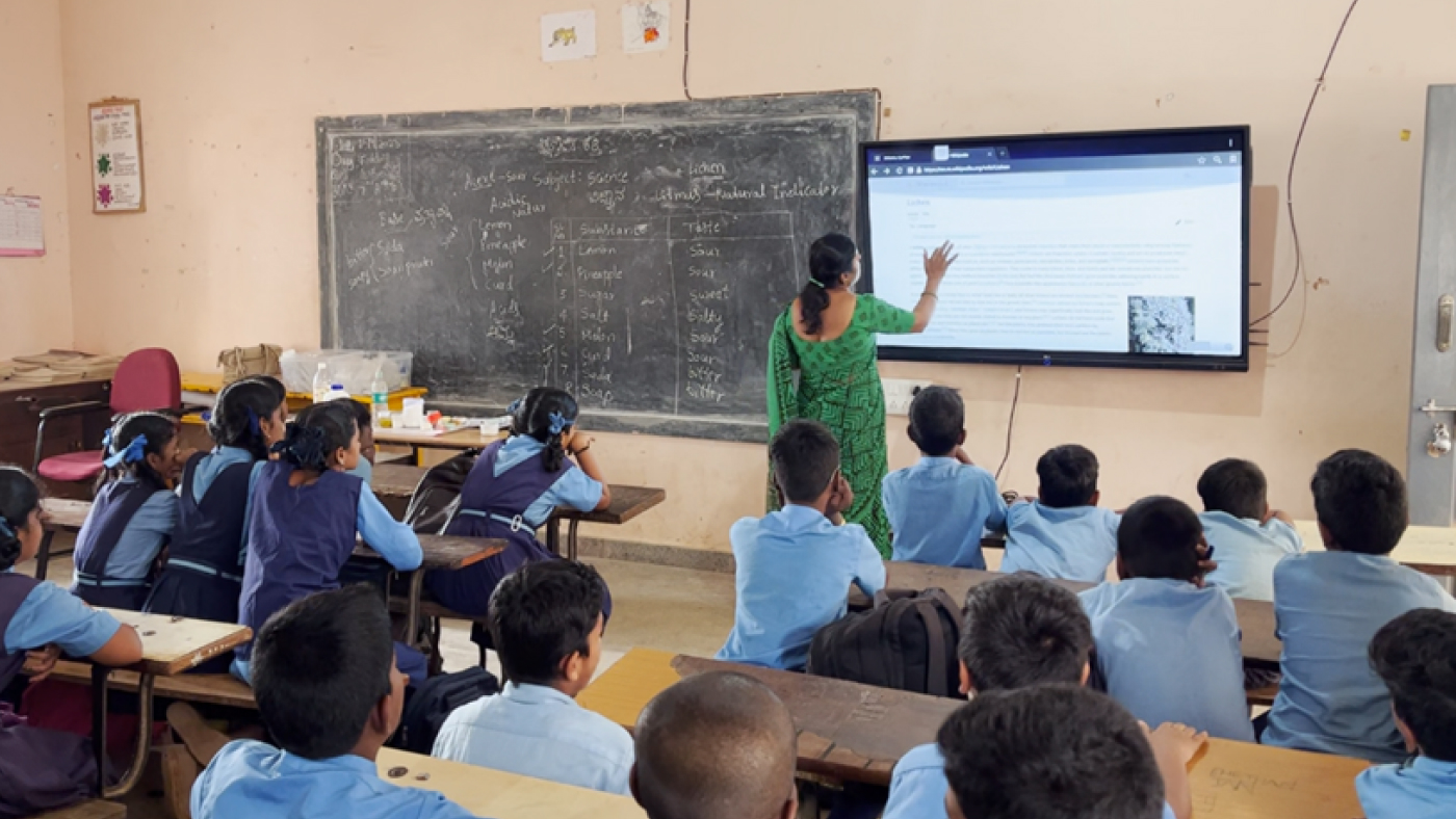
CHANDRA: It’s good for the environment, as well. He’s not putting in more chemicals than are needed. So these are real use cases with farmers in our, in Washington state. We’re also working, for example, we announced a partnership in India, in Maharashtra. This is one of the Centres of Excellence that’s being put up for FarmVibes. So this is again, they are building AI capable … this is across Oxford University; there’s an organization in India called Agriculture Development Trusts; and Microsoft. And working with, of course, Microsoft India, our sales team there. They’ve set up this Centre of Excellence in a village called Baramati in India, where they are going to be taking the same techniques we built and adapting it for smallholder farmers in, in, in that region. So really excited about the value it brings. Yeah.
GEHRKE: Ranveer, it seems like, you know, here at Microsoft, you had the amazing opportunity to really have huge impact. You know, you start on research, then deliver a product, now even extending the product to more use cases. Do you have any career advice for our listeners given where you are and where you’re going?
CHANDRA: Yeah. And as a student, if there are students listening to this, I would say consider going after a PhD. It gives you that exposure, uh, the opportunity to learn, to dig deep, to know a lot about, about a field. If you’re a professional, one of the things I would say is try to go after your passion. If you give your work a bigger meaning than just making money, you’ll go beyond the 9-to-5 or 9-to-6 schedule to make that happen. Like, you know, Johannes, one funny incident is over here, working at Microsoft, most people sit in front of the computer. When I had started working on FarmBeats, every day, I would be driving to this farm. There was another farm about 40 minutes’ drive from here. Every day, summer or winter, I would be driving there to do the experiments. And I would go there, and a few days, especially when it rains, it gets really gloomy [LAUGHS] and you have to go in boots to a farm that is muddy, half flooded. I’d be like, “Why am I doing this? I could be sitting there …” And then the, the way I would argue to myself is, you know, even if 1 percent of what I’m doing works, it will help the lives of so many farmers worldwide. And then that just gave me the extra energy to go even more, to, to just give it everything that I have to make that difference. So that’s something which I tell students, as well. Give whatever work you do—you’re working in AI, you’re working in systems, you’re working in, in building the next plane or building the next ship—give your work a bigger meaning. You will, you’ll enjoy it. It just, um, you’ll give it a lot more than, than just thinking about it as work. And, you’re right, that at Microsoft, we get that opportunity to make that wholesome impact, that is as you did, as well. We get to go to the products. If something ships as part of a Microsoft product, it touches the lives of so many people. Like one of the projects I was with was Xbox, for the Xbox, when I designed that Xbox wireless controller protocol. Now over 100 million people use it, and one of the most common congratulatory messages I get is still around the Xbox. When I’m giving a talk, someone will come and say, “My son said thanks to you because you helped make the Xbox successful.” So that’s one of the opportunities we get. But not just that. We get the opportunity to come do research and think bigger about the problem; take it to a different level and then influence the next generation of product. So this is, uh, thank you. I think this is an awesome place to work, to realize that mission, that, that vision of what we want to achieve in our lives.
GEHRKE: Yeah, I think, I mean it speaks so much to me because that’s something that I was also really excited about. Making the transition from university here to Microsoft, as well.
[OUTRO MUSIC]
Thanks again, Ranveer, for the great conversation.
CHANDRA: Yeah, thank you, Johannes.


 communication technology with Spencer Fowers and Kwame Darko